Nepali Calendar Plus

A feature-rich Flutter package for implementing Nepali (Bikram Sambat) calendar in your applications with extensive customization options, event management, and bilingual support.
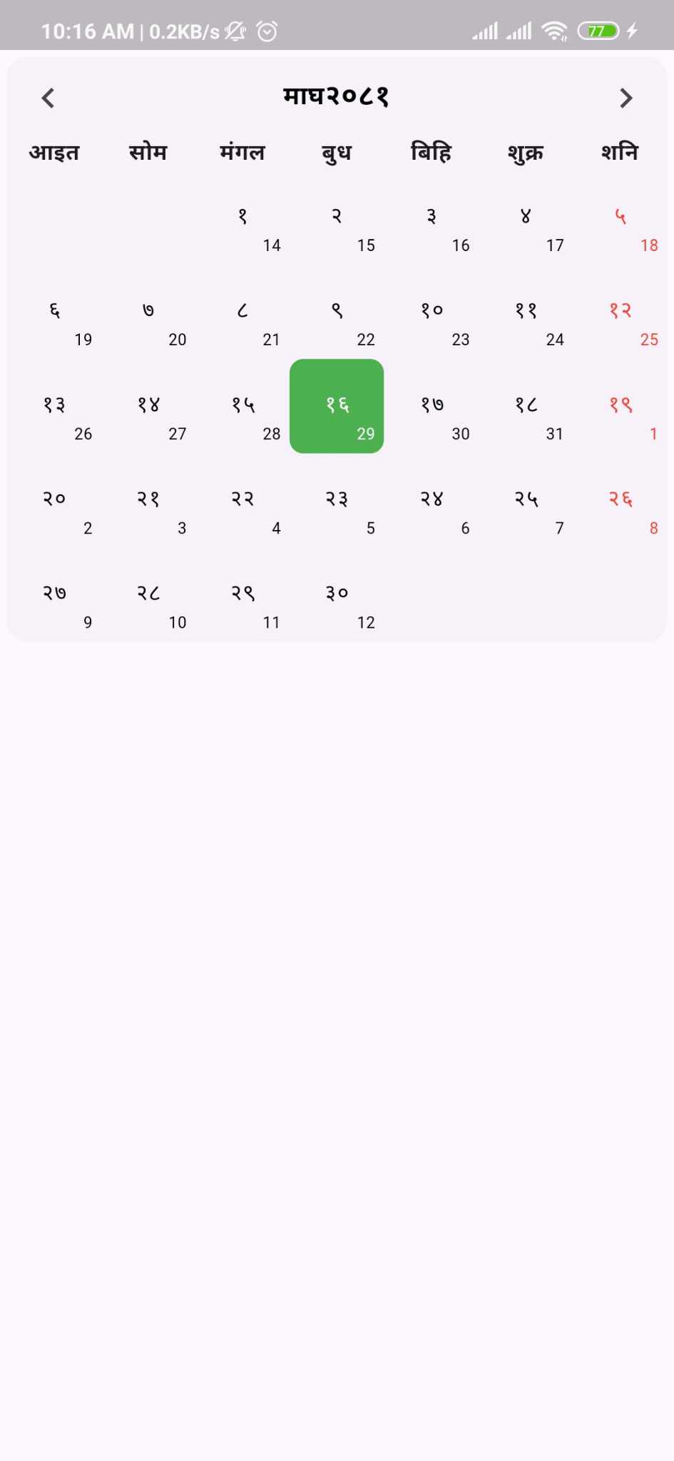
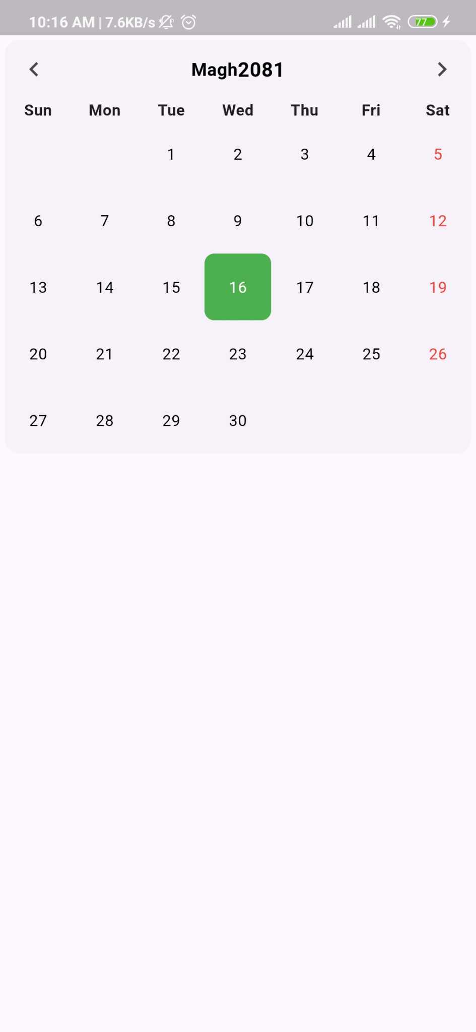
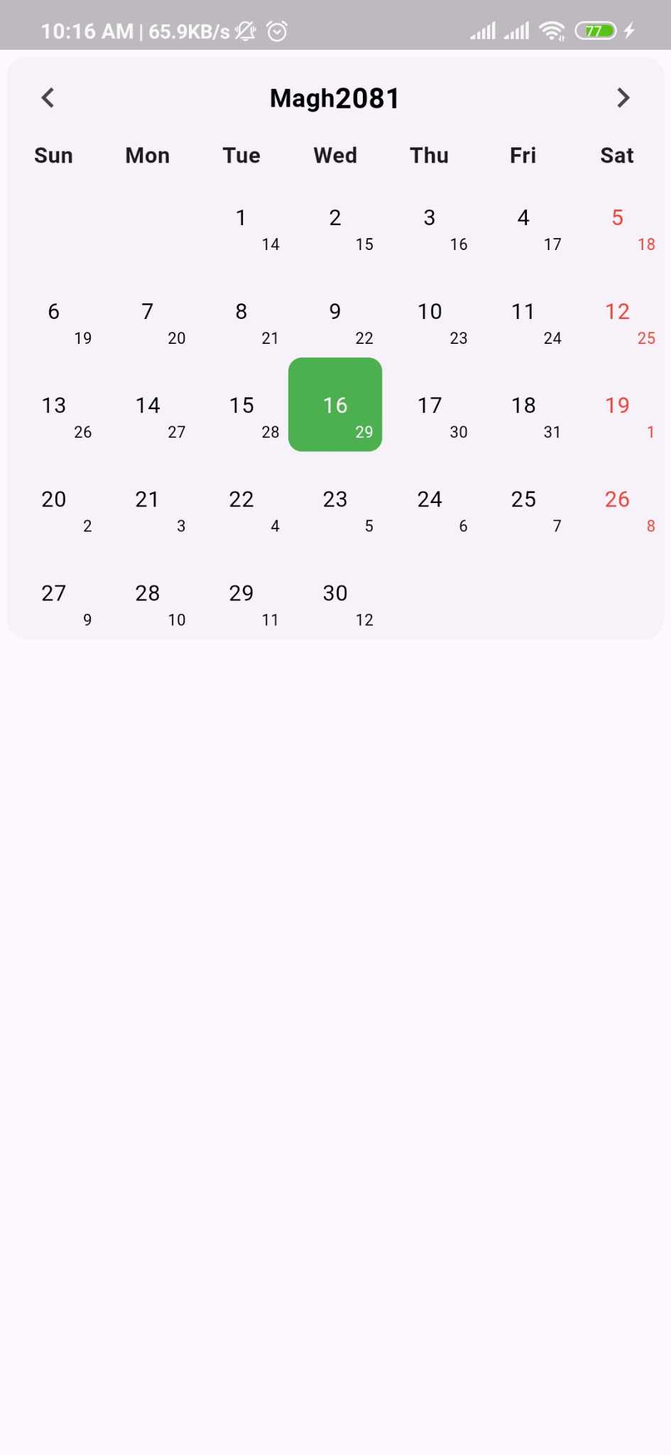
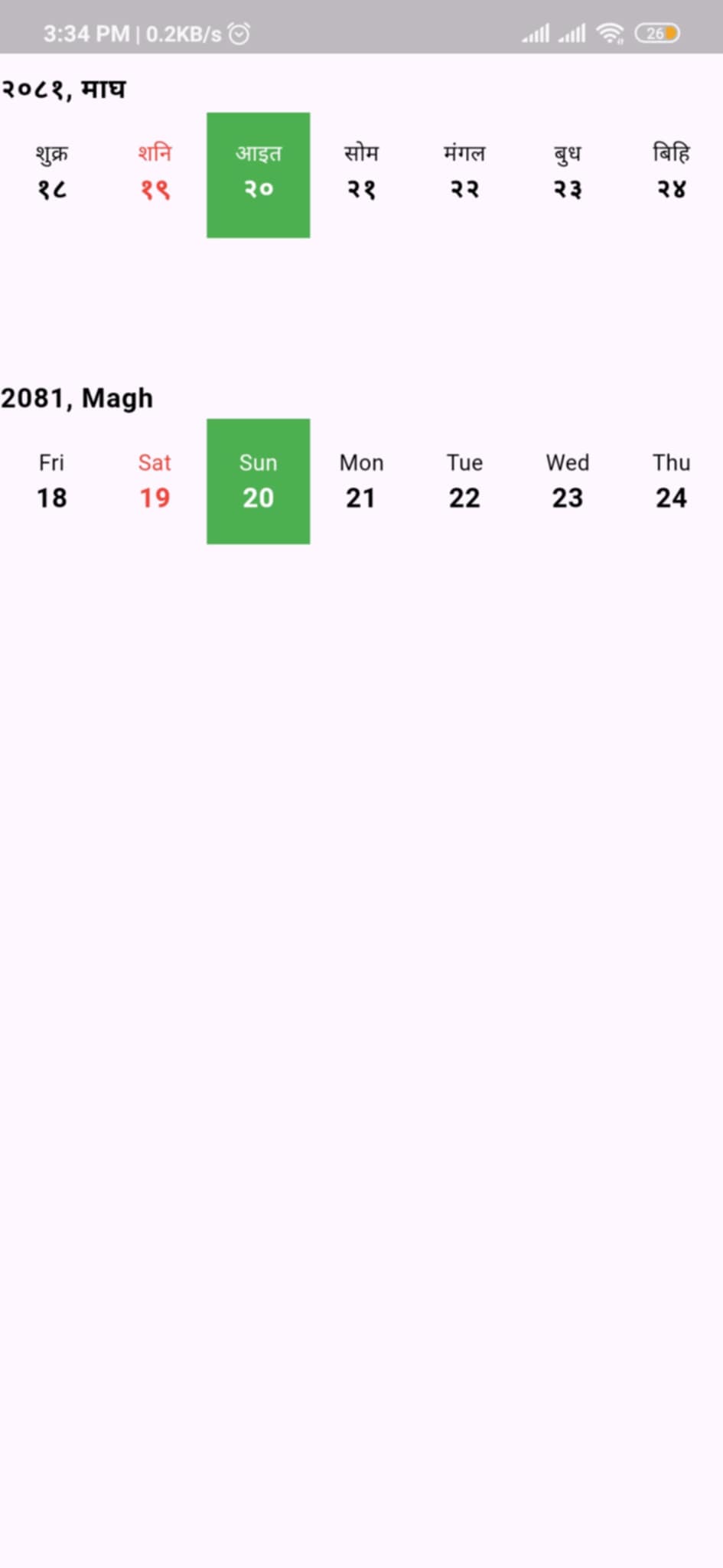
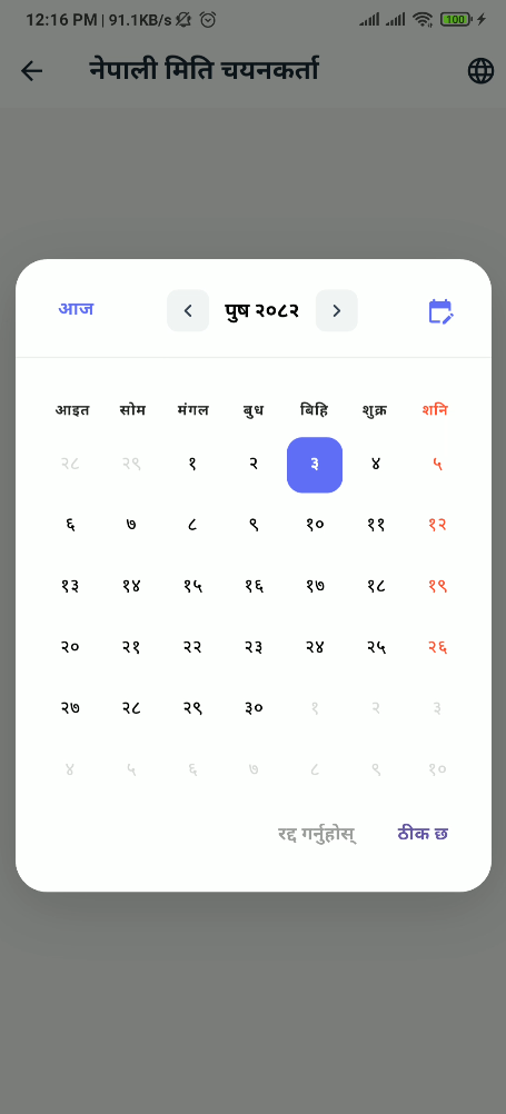
Preview
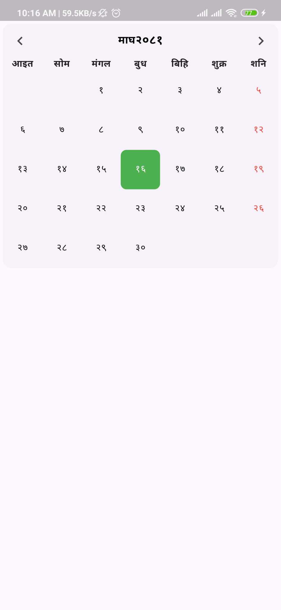 |
 |
 |
 |
 |
 |
Features
- ✅ Full Nepali (Bikram Sambat) calendar support
- ✅ Modal date picker dialog
- ✅ Horizontal and vertical calendar views
- ✅ Bilingual support (Nepali/English)
- ✅ Event management with custom types
- ✅ Holiday highlighting
- ✅ Programmatic navigation with controller
- ✅ Customizable weekend patterns
- ✅ Week start configuration (Sunday/Monday)
- ✅ Custom builders for complete UI control
- ✅ English date conversion display
- ✅ Extensive styling options
- ✅ Today's date highlighting
- ✅ Previous/next month day display
Installation
Add this to your package's pubspec.yaml file:
dependencies:
  nepali_calendar_plus: ^latest_version
Or install it from the command line:
flutter pub add nepali_calendar_plus
Usage
Basic Calendar
import 'package:nepali_calendar_plus/nepali_calendar_plus.dart';

NepaliCalendar(
  calendarStyle: NepaliCalendarStyle(
    config: CalendarConfig(
      showEnglishDate: true,
      language: Language.nepali,
    ),
  ),
  onDayChanged: (date) {
    print('Selected: $date');
  },
)
Horizontal Calendar
HorizontalNepaliCalendar(
  initialDate: NepaliDateTime.now(),
  calendarStyle: NepaliCalendarStyle(
    config: CalendarConfig(
      language: Language.english,
    ),
  ),
  onDateSelected: (date) {
    print('Selected: $date');
  },
)
With Controller
final controller = NepaliCalendarController();

NepaliCalendar(
  controller: controller,
  calendarStyle: NepaliCalendarStyle(
    config: CalendarConfig(
      showEnglishDate: true,
    ),
  ),
)

// Navigate programmatically
controller.jumpToToday();
controller.nextMonth();
controller.previousMonth();
controller.jumpToDate(NepaliDateTime(2080, 1, 1));
Date Picker Dialog
Show a modal date picker dialog for easy date selection:
Future<void> _selectDate(BuildContext context) async {
  final selectedDate = await showNepaliDatePicker(
    context: context,
    initialDate: NepaliDateTime.now(),
    calendarStyle: NepaliCalendarStyle(
      config: CalendarConfig(
        language: Language.nepali,
        weekTitleType: TitleFormat.half,
      ),
      cellsStyle: CellStyle(
        selectedColor: Colors.blue,
        todayColor: Colors.green,
      ),
    ),
  );

  if (selectedDate != null) {
    print('Selected date: $selectedDate');
  }
}

// Use in your widget
ElevatedButton(
  onPressed: () => _selectDate(context),
  child: Text('Pick Date'),
)
Customization
NepaliCalendar(
  calendarStyle: NepaliCalendarStyle(
    config: CalendarConfig(
      showEnglishDate: true,
      showBorder: true,
      language: Language.nepali,
      weekendType: WeekendType.saturday,
      weekStartType: WeekStartType.sunday,
      weekTitleType: TitleFormat.half,
    ),
    cellsStyle: CellStyle(
      todayColor: Colors.green,
      selectedColor: Colors.blue,
      weekDayColor: Colors.red,
    ),
    headersStyle: HeaderStyle(
      monthHeaderStyle: TextStyle(
        fontSize: 18,
        fontWeight: FontWeight.bold,
      ),
    ),
  ),
)
Event Management
class MyEvent {
  final String title;
  final String description;

  MyEvent(this.title, this.description);
}

final events = [
  CalendarEvent<MyEvent>(
    date: NepaliDateTime(2082, 9, 10),
    isHoliday: true,
    additionalInfo: MyEvent("Christmas", "Holiday"),
  ),
];

NepaliCalendar<MyEvent>(
  eventList: events,
  checkIsHoliday: (event) => event.isHoliday,
  onDayChanged: (date) => print('Selected: $date'),
  onMonthChanged: (date) => print('Month: ${date.month}'),
)
Custom Builders
NepaliCalendar(
  calendarBuilder: CalendarBuilder(
    // Custom event widget
    eventBuilder: (context, index, date, event) {
      return Container(
        padding: EdgeInsets.all(8),
        child: Text(event.additionalInfo?.title ?? ''),
      );
    },

    // Custom cell widget
    cellBuilder: (data) {
      return Container(
        decoration: BoxDecoration(
          color: data.isToday ? Colors.blue : null,
          shape: BoxShape.circle,
        ),
        child: Center(child: Text('${data.day}')),
      );
    },

    // Custom header
    headerBuilder: (date, controller) {
      return Row(
        mainAxisAlignment: MainAxisAlignment.spaceBetween,
        children: [
          IconButton(
            icon: Icon(Icons.chevron_left),
            onPressed: controller.previousMonth,
          ),
          Text('${date.month}/${date.year}'),
          IconButton(
            icon: Icon(Icons.chevron_right),
            onPressed: controller.nextMonth,
          ),
        ],
      );
    },
  ),
)
Example Project
Check out the example folder for a complete working example with all features demonstrated.
API Reference
For detailed API documentation, visit pub.dev documentation.
Key Components
- NepaliCalendar - Main calendar widget with full month view
- HorizontalNepaliCalendar - Horizontal scrolling date picker
- showNepaliDatePicker - Modal date picker dialog
- NepaliCalendarController - Programmatic navigation control
- CalendarConfig - Centralized configuration
- CalendarBuilder - Custom component builders
- CalendarEvent - Event model with generic type support
Configuration Options
- Language:
Language.nepali,Language.english - WeekendType:
saturday,sunday,saturdayAndSunday,fridayAndSaturday - WeekStartType:
sunday,monday - TitleFormat:
full,half
License
This project is licensed under the MIT License - see the LICENSE file for details.
Contributing
Contributions are welcome! Please feel free to submit a Pull Request.
- Fork the repository
- Create your feature branch
- Commit your changes
- Push to the branch
- Open a Pull Request
Contact
- Issues: Report Issues
- Email: [email protected]