flutter_expandable_fab 1.7.1  flutter_expandable_fab: ^1.7.1 copied to clipboard
 zuvola.com
Speed dial FAB that can show/hide multiple action buttons with animation.
flutter_expandable_fab #

flutter_expandable_fab is the speed dial FAB that can show/hide multiple action buttons with animation.
This is an extension of the code in this article.
https://docs.flutter.dev/cookbook/effects/expandable-fab
Fan style & Blur overlay #

Vertical style & Color overlay #

Horizontal style & Custom buttons #
Getting started #
import 'package:flutter_expandable_fab/flutter_expandable_fab.dart';
Scaffold(
floatingActionButtonLocation: ExpandableFab.location,
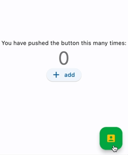
floatingActionButton: ExpandableFab(
children: [
FloatingActionButton.small(
heroTag: null,
child: const Icon(Icons.edit),
onPressed: () {},
),
FloatingActionButton.small(
heroTag: null,
child: const Icon(Icons.search),
onPressed: () {},
),
],
),
),
Open/Close programmatically #
final _key = GlobalKey<ExpandableFabState>();

Scaffold(
  floatingActionButtonLocation: ExpandableFab.location,
  floatingActionButton: ExpandableFab(
    key: _key,
    children: [
      FloatingActionButton.small(
        child: const Icon(Icons.edit),
        onPressed: () {
          final state = _key.currentState;
          if (state != null) {
            debugPrint('isOpen:${state.isOpen}');
            state.toggle();
          }
        },
      ),
    ],
  ),
),
Properties #
| Property | Description | Default |
|---|---|---|
| distance | Distance from children | 100 |
| duration | Animation duration | 250ms |
| fanAngle | Angle of opening when fan type | 90 |
| initialOpen | Open at initial display | false |
| type | The type of behavior of this widget | fan |
| closeButtonStyle | Style of the close button | |
| child | The widget below this widget in the tree | |
| childrenOffset | For positioning of children widgets | |
| children | The widgets below this widget in the tree | |
| foregroundColor | The default foreground color for icons and text within the button | |
| backgroundColor | The button's background color | |
| onOpen | Will be called before opening the menu | |
| afterOpen | Will be called after opening the menu | |
| onClose | Will be called before the menu closes | |
| afterClose | Will be called after the menu closes | |
| overlayStyle | Provides the style for overlay. No overlay when null. | |
| openButtonHeroTag | The tag to apply to the open button's [Hero] widget. | |
| closeButtonHeroTag | The tag to apply to the close button's [Hero] widget. | |
| collapsedFabSize | The size of the collapsed FAB. | regular |
| expandedFabSize | The size of the expanded FAB. | small |
Metadata
415
likes
0
points
18k
downloads
Publisher
Weekly Downloads
Metadata
Speed dial FAB that can show/hide multiple action buttons with animation.
Repository (GitHub)
View/report issues
License
 unknown (license)