flutter_tilt 2.1.0  flutter_tilt: ^2.1.0 copied to clipboard
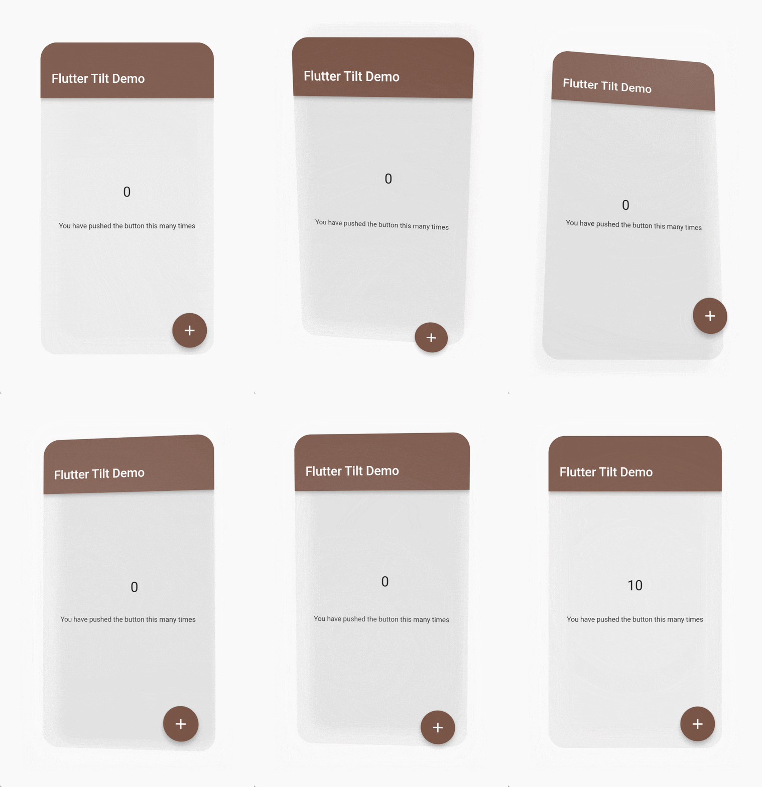
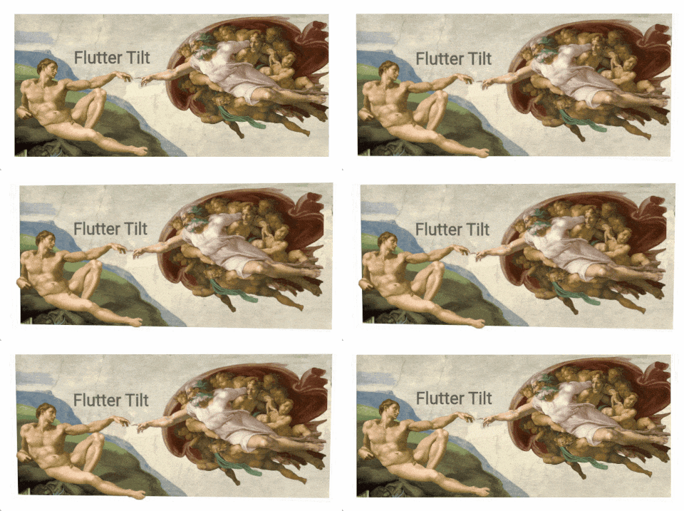
Easily apply tilt parallax hover effects for Flutter, which supports tilt, light, shadow effects, gyroscope sensors and many custom parameters.
📓 Language: English | 中文
🎁 Check out the Live Demo.
💡 See the Migration Guide to learn how to migrate between breaking changes.
Flutter Tilt
Easily Apply Tilt Parallax Hover Effects for Flutter!

|

|

|
|
|
Check out the Live Demo. |
|
Table of contents 🪄 #
Features ✨ #
- 📦 Tilt effect
- 🔦 Light effect
- 💡 Shadow effect
- 👀 Parallax effect
- 📱 Gyroscope sensor support (Sensors compatibility)
- 🧱 Multiple layouts
- 👇 Supports hover, touch and sensors events
- 🖼️ Smooth animation
- ⚙️ Many custom parameters
Install 🎯 #
Versions compatibility 🐦 #
| Flutter | 3.0.0+ | 3.3.0+ |
|---|---|---|
| flutter_tilt 2.0.0+ | ❌ | ✅ |
| flutter_tilt 1.0.0+ | ✅ | ❌ |
Add package 📦 #
Run this command with Flutter,
$ flutter pub add flutter_tilt
or add flutter_tilt to pubspec.yaml dependencies manually.
dependencies:
  flutter_tilt: ^latest_version
Sensors compatibility 📱 #
Sensors are triggered only on these platforms.
| Android | iOS | Web (HTTPS) | macOS | Linux | Windows |
|---|---|---|---|---|---|
| ✅ | ✅ | Browser compatibility | ❌ | ❌ | ❌ |
- Currently Web uses the Sensor API - Gyroscope, but it is not compatible with some of the major browsers, such as Safari, Firefox.
After that maybe replace it with DeviceMotionEvent.
Gesture priority 📱 #
When multiple gestures are enabled, they are triggered based on priority:
Touch > Hover > Sensors
Simple usage 📖 #
Example: flutter_tilt/example
Tilt 📦 #
Tilt widget will have default tilt, shadow, and light effects.
/// Import flutter_tilt
import 'package:flutter_tilt/flutter_tilt.dart';

...
Tilt(
  child: Container(
    width: 150.0,
    height: 300.0,
    color: Colors.grey,
  ),
),
...
Parallax 👀 #
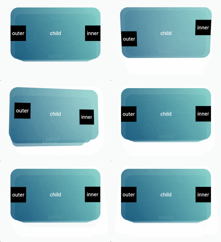
TiltParallax widget can only be used in the childLayout of Tilt widget.
/// Import flutter_tilt
import 'package:flutter_tilt/flutter_tilt.dart';

...
Tilt(
  childLayout: const ChildLayout(
    outer: [
      /// Parallax here
      Positioned(
        child: TiltParallax(
          child: Text('Parallax'),
        ),
      ),
      /// Parallax here
      Positioned(
        top: 20.0,
        left: 20.0,
        child: TiltParallax(
          size: Offset(-10.0, -10.0),
          child: Text('Tilt'),
        ),
      ),
    ],
  ),
  child: Container(
    width: 150.0,
    height: 300.0,
    color: Colors.brown,
  ),
),
...
Usage 📖 #
Tilt widget parameters 🤖 #
| Parameter | Type | Default | Description |
|---|---|---|---|
child required |
Widget |
- | Create a widget that its child widget can be tilted. |
| childLayout | ChildLayout | ChildLayout() |
Other child layouts. e.g. parallax inner, outer, behind. |
| disable | bool |
false |
Disable all effects. |
| fps | int |
60 |
Gesture triggered frames. |
| border | BoxBorder? |
null |
BoxDecoration border. |
| borderRadius | BorderRadiusGeometry? |
null |
BoxDecoration borderRadius. |
| clipBehavior | Clip |
Clip.antiAlias |
Flutter clipBehavior. |
| tiltConfig | TiltConfig | TiltConfig() |
Tilt effect config. |
| lightConfig | LightConfig | LightConfig() |
Light effect config. |
| shadowConfig | ShadowConfig | ShadowConfig() |
Shadow effect config. |
| onGestureMove | void Function(TiltDataModel, GesturesType)? |
null |
Gesture move callback. |
| onGestureLeave | void Function(TiltDataModel, GesturesType)? |
null |
Gesture leave callback. |
TiltParallax widget parameters 🤖 #
| Parameter | Type | Default | Description |
|---|---|---|---|
child required |
Widget |
- | Create a widget with parallax. |
| size | Offset |
Offset(10.0, 10.0) |
Parallax size (pixel). |
| filterQuality | FilterQuality |
null |
Flutter FilterQuality. |
ChildLayout 📄 #
| Parameter | Type | Default | Description |
|---|---|---|---|
| outer | List<Widget> |
<Widget>[] |
As with Stack, you can use the Stack layout to create widgets that are outer of the child. e.g. parallax effects. |
| inner | List<Widget> |
<Widget>[] |
As with Stack, you can use the Stack layout to create widgets that are inner of the child. e.g. parallax effects. |
| behind | List<Widget> |
<Widget>[] |
As with Stack, you can use the Stack layout to create widgets that are behind of the child. e.g. parallax effects. |
TiltConfig 📄 #
| Parameter | Type | Default | Description |
|---|---|---|---|
| disable | bool |
false |
Only disable the tilt effect. |
| initial | Offset? |
null |
Initial tilt progress, range (x, y): (1, 1) to (-1, -1), you can exceed the range, but the maximum tilt angle during gesture movement is always tilted according to [TiltConfig.angle]. e.g. (0.0, 0.0) center (1.0, 1.0) Maximum tilt top left [TiltConfig.angle]. |
| angle | double |
10.0 |
Maximum tilt angle. e.g. 180 will flip. |
| direction | List<TiltDirection>? |
null |
Tilt Direction, multiple directions, customized direction values. |
| enableReverse | bool |
false |
Tilt reverse, can be tilted up or down. |
| filterQuality | FilterQuality |
null |
Flutter FilterQuality. |
| enableGestureSensors | bool |
true |
Gyroscope sensor triggered tilt. |
| sensorFactor | double |
10.0 |
Sensor trigger factor (sensitivity). |
| enableSensorRevert | bool |
true |
Enable sensor tilt revert, will revert to the initial state. |
| sensorRevertFactor | double |
0.05 |
Sensor revert factor (damping), range of values: 0-1. |
| sensorMoveDuration | Duration |
Duration(milliseconds: 50) |
Animation duration during sensor move. |
| enableGestureHover | bool |
true |
Hover gesture triggered tilt. |
| enableGestureTouch | bool |
true |
Touch gesture triggered tilt. |
| enableRevert | bool |
true |
Enable tilt tevert, will revert to the initial state (touch, hover gestures only). |
| enableOutsideAreaMove | bool |
true |
Tilt can continue to be triggered outside the area. ( only when the pointer is pressed and moved) |
| moveDuration | Duration |
Duration(milliseconds: 100) |
Animation duration during gesture move (touch, hover gestures only). |
| leaveDuration | Duration |
Duration(milliseconds: 300) |
Animation duration after gesture leave (touch, hover gestures only). |
| moveCurve | Curve |
Curves.linear |
Animation curve during gesture move (touch, hover gestures only). |
| leaveCurve | Curve |
Curves.linear |
Animation curve after gesture leave (touch, hover gestures only). |
LightConfig 📄 #
| Parameter | Type | Default | Description |
|---|---|---|---|
| disable | bool |
false |
Only disable the light effect. |
| color | Color |
Color(0xFFFFFFFF) |
Light color. |
| minIntensity | double |
0.0 |
Color minimum opacity, also initial opacity. |
| maxIntensity | double |
0.5 |
Color maximum opacity for tilt progresses. |
| spreadFactor | double |
4.0 |
Light spread factor, relative to current widget size. |
| direction | LightDirection |
LightDirection.around |
Light direction. Affects: [ShadowConfig.direction] (not affected after configuration). |
| enableReverse | bool |
false |
Reverse light direction. Affects: [ShadowConfig.direction] (not affected after configuration). [ShadowConfig.enableReverse] (not affected after configuration). |
ShadowConfig 📄 #
| Parameter | Type | Default | Description |
|---|---|---|---|
| disable | bool |
false |
Only disable the shadow effect. |
| color | Color |
Color(0xFF9E9E9E) |
Shadow color. |
| minIntensity | double |
0.0 |
Color minimum opacity, also initial opacity. |
| maxIntensity | double |
0.5 |
Color maximum opacity as tilt progresses. |
| offsetInitial | Offset |
Offset(0.0, 0.0) |
Initial value of shadow offset (pixel). e.g. (0.0, 0.0) center. (40.0, 40.0) Offset 40 pixels to the top left. |
| offsetFactor | double |
0.1 |
Shadow offset factor, relative to current widget size. |
| spreadInitial | double |
0.0 |
Initial value of shadow spread radius (pixel). |
| spreadFactor | double |
0.0 |
Shadow spread radius factor, relative to current widget size. |
| minBlurRadius | double |
10.0 |
Minimum blur radius, also initial blur radius. |
| maxBlurRadius | double |
20.0 |
Maximum blur radius for tilt progresses. |
| direction | ShadowDirection? |
null |
Shadow direction. |
| enableReverse | bool? |
null |
Reverse shadow direction. |
Contributors ✨ #
|
AmosHuKe |
License 📄 #
Open sourced under the MIT license.
© AmosHuKe


