
liquid_glass_native 0.3.1  liquid_glass_native: ^0.3.1 copied to clipboard
Native Apple Liquid Glass UI for Flutter on iOS 26+ — real SwiftUI/UIKit glass widgets (buttons, tab bar, sheets, pickers), not a blur fake. Graceful fallback below iOS 26.
Changelog #
0.3.1 #
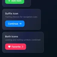
- Docs: rewritten README with a widget screenshot gallery, platform support matrix, and FAQ.
- Meta: add a pub.dev screenshot carousel captured from the example app on
iOS 26, and swap the
nativetopic forglassmorphism. - No library or plugin code changes; identical runtime behavior to 0.3.0.
0.3.0 #
- New: cross-platform shader-based
LiquidGlassandLiquidGlassViewwith configurable refraction, chromatic aberration, tint, highlights, and press interaction. - New: bundled fragment shader and standalone shader demo entrypoint.
0.2.0 #
- Refactor: shared
GlassPlatformViewbase class — fixes lifecycle bugs and reduces per-widget boilerplate. - New:
brightnessproperty onLiquidGlassTabBarto control native interface style (light/dark). - Fix: theme-aware brightness on
LiquidGlassSegmentedControl; invisible spinner on dark backgrounds is resolved.
0.1.0 #
- Add
LiquidGlassTheme/LiquidGlassThemeDatafor app-wide glass defaults (tint, borderRadius, interactive, labelColor, respectAccessibility). Widgets resolve as explicit param ?? theme ?? built-in default. - Honor system accessibility settings in native glass: Reduce Transparency (opaque surface) and Reduce Motion (no interactive touch response).
- New widgets:
LiquidGlassCard,LiquidGlassLabeledSwitch,LiquidGlassCheckbox,LiquidGlassTextField. TabItemgains an optionalbadge.
0.0.2 #
- Add
example/example.mdwith curated usage snippets so the pub.dev Example tab shows real widget usage instead of app boilerplate.
0.0.1 #
- Initial release of
liquid_glass_native. - Native Apple Liquid Glass widgets for Flutter, rendered by SwiftUI/UIKit
platform views, using Apple's authentic
glassEffecton iOS 26+ with a graceful fallback on older iOS and non-iOS platforms. - Widgets: button, button group, icon button, switch, slider, stepper, segmented control, container, navigation bar, tab bar, toolbar, search bar, progress view, activity indicator, color picker, date picker, menu.
- Modal presenters: sheet, alert, popover.
Metadata
2
likes
150
points
167
downloads

Documentation
Publisher
unverified uploader
Weekly Downloads
Metadata
Native Apple Liquid Glass UI for Flutter on iOS 26+ — real SwiftUI/UIKit glass widgets (buttons, tab bar, sheets, pickers), not a blur fake. Graceful fallback below iOS 26.
Repository (GitHub)
View/report issues
Topics
#liquid-glass #ios #cupertino #glassmorphism #ui
License
 MIT (license)
Dependencies
More
Packages that depend on liquid_glass_native
Packages that implement liquid_glass_native