modal_date_picker 0.0.1  modal_date_picker: ^0.0.1 copied to clipboard
 giansandoval.com
Un paquete Flutter para sumar dos números.
Modal Date Picker #
A modal-based date picker for Flutter that provides an intuitive and customizable way to select dates. Designed for seamless integration on Android, iOS, and Web. 🎉
Compatible with Android & iOS & Web. 😍

✨ Features #
Fully customizable Supports multiple locales (e.g., English, Spanish, etc.) Allows different date formats Customizable colors and styles Works seamlessly with Flutter's TextFormField
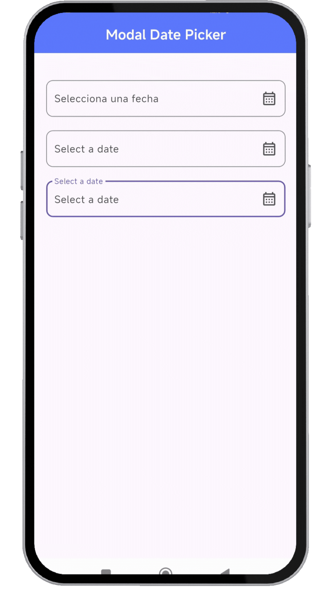
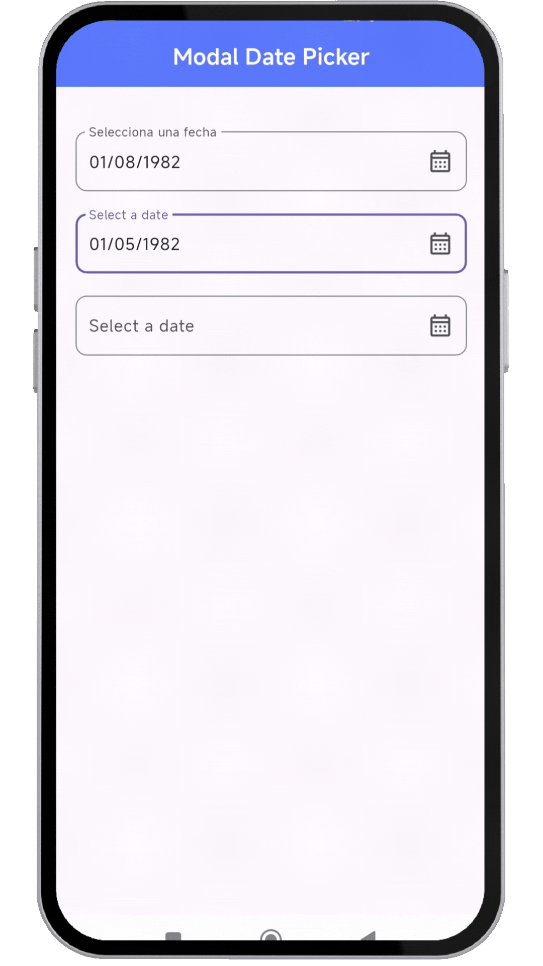
📸 Showcase #
🚀 Installation #
Add the dependency to your pubspec.yaml:
dependencies:
  modal_date_picker : "^lastest_version"
Then, run:
flutter pub get
🔥 Usage #
Import the package:
import 'package:modal_date_picker/modal_date_picker.dart';
📌 Example #
import 'package:flutter/material.dart';
import 'package:modal_date_picker/modal_date_picker.dart';

void main() {
  runApp(MaterialApp(home: const MyApp()));
}


class MyApp extends StatelessWidget {
  const MyApp({super.key});

  @override
  Widget build(BuildContext context) {
    return MaterialApp(
       debugShowCheckedModeBanner: false,
       home: HomePage(),
    );
  }
}

class HomePage extends StatefulWidget {
  const HomePage({super.key});

  @override
  State<HomePage> createState() => _HomePageState();
}

class _HomePageState extends State<HomePage> {
  final TextEditingController _controller = TextEditingController();
  final TextEditingController _controller2 = TextEditingController();
  final TextEditingController _controller3 = TextEditingController();

  @override
  Widget build(BuildContext context) {
    return Scaffold(
      appBar: AppBar(
        centerTitle: true,
        backgroundColor: Colors.indigoAccent,
        title: const Text('Modal Date Picker', style: TextStyle(color: Colors.white,fontWeight: FontWeight.bold)),
      ),
      body: Center(
        child: Padding(
          padding: const EdgeInsets.symmetric(horizontal: 20),
          child: Column(
            children: [
              SizedBox(height: 40),
              //ejemplo de usar en español
              TextFormField(
                readOnly: true,
                controller: _controller,
                decoration: InputDecoration(
                  label: const Text('Selecciona una fecha'),
                  hintText: 'Selecciona una fecha',
                  suffixIcon: Icon(Icons.calendar_month_outlined),
                  border: OutlineInputBorder(
                    borderRadius: BorderRadius.circular(10),
                  ),
                ),
                onTap: () {
                  dateCustomModalBottomSheet(
                    context: context,
                    controller: _controller,
                    //OPCIONALES
                    locale: Locale('es', 'ES'),
                    //POR DEFECTO dd/MM/yyyy - asi puedes cambiar el orden
                    viewType: [DatePickerViewType.day, DatePickerViewType.month, DatePickerViewType.year],
                   );
                },
              ),
              SizedBox(height: 20),
              //ejemplo de usar en ingles
              TextFormField(
                readOnly: true,
                controller: _controller2,
                decoration: InputDecoration(
                  label: const Text('Select a date'),
                  hintText: 'Select a date',
                  suffixIcon: Icon(Icons.calendar_month_outlined),
                  border: OutlineInputBorder(
                    borderRadius: BorderRadius.circular(10),
                  ),
                ),
                onTap: () {
                  dateCustomModalBottomSheet(
                    context: context,
                    controller: _controller2,
                   );
                },
              ),
              SizedBox(height: 20),
              //ejemplo al cambiar los colores
               TextFormField(
                readOnly: true,
                controller: _controller3,
                decoration: InputDecoration(
                  label: const Text('Select a date'),
                  hintText: 'Select a date',
                  suffixIcon: Icon(Icons.calendar_month_outlined),
                  border: OutlineInputBorder(
                    borderRadius: BorderRadius.circular(10),
                  ),
                ),
                onTap: () {
                  dateCustomModalBottomSheet(
                    context: context,
                    controller: _controller3,
                    styleConfirmText: const TextStyle(fontWeight: FontWeight.bold, height: 1.0,color: Colors.white),
                    //OPCIONALES
                    //cambiar colores
                    colorBackground: Colors.blue,
                    colorIndicator: Colors.white,
                    locale: Locale('en', 'US'),
                    //POR DEFECTO dd/MM/yyyy - asi puedes cambiar el orden
                    viewType: [DatePickerViewType.day, DatePickerViewType.month, DatePickerViewType.year],
                    selectedTextStyle: const TextStyle(color: Colors.black, fontWeight: FontWeight.bold, fontSize: 18),
                    textStyle: const TextStyle(color: Colors.white),
                   );
                },
              ),
            ],
          ),
        )
      ),
    );
  }
}
🎨 Customization #
You can customize the date picker appearance, locale, and format.
dateCustomModalBottomSheet(
  context: context,
  controller: _controller,
  locale: const Locale('es', 'ES'), // Spanish
  colorBackground: Colors.blue, // Background color
  colorIndicator: Colors.white, // Indicator color
  selectedTextStyle: const TextStyle(
    color: Colors.black,
    fontWeight: FontWeight.bold,
    fontSize: 18,
  ),
  textStyle: const TextStyle(color: Colors.white),
);
📜 License #
Copyright © 2025, Flutter Project Authors.

This software is open-source and may be used, modified, and distributed under the following conditions:

1. Attribution: This license and the original copyright notice must be retained in all copies or derivatives.
2. Unaltered License: Redistribution must preserve this license without modifications.
3. Collaboration: Contributions are encouraged as long as they comply with this license.
4. Commercial & Non-Commercial Use: Allowed under the above conditions.
5. No Endorsement: Names of authors and contributors cannot be used to endorse derivative products without written permission.

Disclaimer: This software is provided "as is" without any warranties. The authors are not liable for any damages resulting from its use.
Metadata
4
likes
0
points
147
downloads
Publisher
Weekly Downloads
Metadata
Un paquete Flutter para sumar dos números.
Repository (GitHub)
View/report issues
License
 unknown (license)