panes 1.0.0+1  panes: ^1.0.0+1 copied to clipboard
 sofluffy.io
A powerful Flutter package for creating complex, resizable, multi-pane layouts. Ideal for building IDE-like interfaces, advanced dashboards, and desktop applications.
panes #

A powerful Flutter package for creating complex, resizable, multi-pane layouts. Ideal for building IDE-like interfaces, advanced dashboards, and desktop applications.
Features #
- 🪟 Flexible Layouts: Create complex arrangements with resizable horizontal and vertical panes.
- 📱 Responsive: Works great on Desktop and Web, providing a native-feeling experience.
- 🎨 Theming: Fully customizable appearance using
PaneThemeto match your app's design. - ⌨️ Programmatic Control: Show, hide, maximize, and resize panes using
PaneController. - 💾 Save/Load State: Serialize and restore layout configurations with
save()andload(). - 📑 Tabbed Interfaces: Built-in support for tabbed panes with icons and action buttons.
- 🖱️ Customizable Resizers: Control the thickness, color, and hit-test area of split handlers.
- ⌨️ Keyboard Accessibility: Resizers are focusable (Tab) and controllable with Arrow keys.
- 🔄 Reset & Maximize: Double-tap resizers to reset sizes, or maximize any pane to full area.
Getting started #
Add panes to your pubspec.yaml:
dependencies:
  panes: ^1.0.0
Or run:
flutter pub add panes
Usage #
Flexible Layouts with MultiPane #
MultiPane gives you full control to build arbitrary split-view layouts (horizontal or vertical, nested, etc.). This is the core widget of the package.
- Define your panes:
final controller = PaneController(
  entries: [
    PaneEntry(
      id: 'sidebar',
      initialSize: PaneSize.pixel(250),
      minSize: PaneSize.pixel(100),
      autoHide: true,
    ),
    PaneEntry(
      id: 'content',
      initialSize: PaneSize.fraction(1.0),
    ),
  ],
);
- Render the MultiPane:
MultiPane(
  direction: Axis.horizontal,
  controller: controller,
  paneBuilder: (context, id) => switch (id) {
    'sidebar' => Sidebar(),
    'content' => Content(),
    _ => const SizedBox(),
  },
)
Standard IDE Layout #
For common IDE-like structures, IdeLayout provides a pre-configured setup with sidebars and a center area.
import 'package:flutter/material.dart';
import 'package:panes/panes.dart';

void main() {
  runApp(const MaterialApp(home: MyIde()));
}

class MyIde extends StatefulWidget {
  const MyIde({super.key});

  @override
  State<MyIde> createState() => _MyIdeState();
}

class _MyIdeState extends State<MyIde> {
  late final IdeController _controller;

  @override
  void initState() {
    super.initState();
    _controller = IdeController(
      leftSize: PaneSize.pixel(250),
      rightSize: PaneSize.pixel(250),
      bottomSize: PaneSize.pixel(150),
    );
  }

  @override
  Widget build(BuildContext context) {
    return Scaffold(
      body: IdeLayout(
        controller: _controller,
        // Left Sidebar (e.g., File Explorer)
        leftPanelBuilder: (context) => Container(
          color: Colors.grey[200],
          child: const Center(child: Text('Explorer')),
        ),
        // Center Area (e.g., Code Editor)
        centerBuilder: (context) => Container(
          color: Colors.white,
          child: const Center(child: Text('Editor')),
        ),
        // Right Sidebar (e.g., Outline)
        rightPanelBuilder: (context) => Container(
          color: Colors.grey[200],
          child: const Center(child: Text('Outline')),
        ),
        // Bottom Panel (e.g., Terminal)
        bottomPanelBuilder: (context) => Container(
          color: Colors.black,
          child: const Center(
            child: Text('Terminal', style: TextStyle(color: Colors.white)),
          ),
        ),
      ),
    );
  }
}
Listening to Pane State Changes #
IdeLayout provides callbacks to react to visibility and maximize state changes:
IdeLayout(
  controller: _controller,
  // Called when any pane's visibility changes
  onPaneStateChanged: (IdePane pane, bool isVisible) {
    print('$pane is now ${isVisible ? "visible" : "hidden"}');
  },
  // Called when maximize state changes (true = fully maximized)
  onMaximizeStateChanged: (bool isMaximized) {
    print('Maximized: $isMaximized');
  },
  // ... builders
)
The IdePane enum provides pane identifiers with embedded string IDs:
enum IdePane {
  left('left'),
  right('right'),
  bottom('bottom'),
  center('center'),
  centerContainer('centerContainer');

  final String id;

  const IdePane(this.id);
}
Tabbed Panes #
Use TabbedPane to easily create a panel with tabs, headers, and actions.
TabbedPane(
  selectedIndex: _selectedIndex,
  onTabSelected: (index) => setState(() => _selectedIndex = index),
  labels: const ['Terminal', 'Output', 'Debug'],
  icons: const [Icons.terminal, Icons.text_snippet, Icons.bug_report],
  actions: [
    IconButton(
      icon: const Icon(Icons.add, size: 16),
      onPressed: () {},
    ),
  ],
  tabBuilder: (context, index) {
    return Center(child: Text('Content for tab $index'));
  },
)
Theming #
PaneThemeData is a ThemeExtension, so you can apply it via ThemeData:
MaterialApp(
  theme: ThemeData(
    extensions: [
      const PaneThemeData(
        resizerColor: Color(0xFF252526),
        resizerHoverColor: Color(0xFF007ACC),
        resizerFocusedColor: Color(0xFF005A9E),
        resizerThickness: 1.0,
        tabHeaderColor: Color(0xFF2D2D2D),
        tabBackground: Color(0xFF1E1E1E),
        tabSelectedBackground: Color(0xFF1E1E1E),
        tabLabelColor: Color(0xFF969696),
        tabSelectedLabelColor: Colors.white,
      ),
    ],
  ),
  home: MyApp(),
)
Alternatively, wrap your layout with PaneTheme for localized theming:
PaneTheme(
  data: const PaneThemeData(
    resizerColor: Color(0xFF252526),
    resizerHoverColor: Color(0xFF007ACC),
  ),
  child: IdeLayout(...),
)
Additional information #
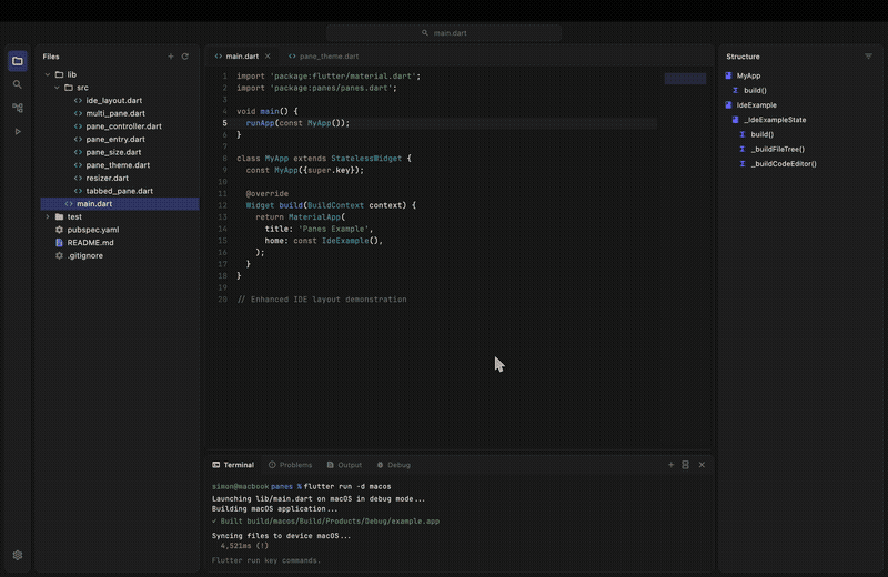
Check out the example directory for a complete IDE implementation that demonstrates how to build a JetBrains Fleet-like UI with the modern "Islands UI" design, featuring floating panels with rounded corners, file trees, and syntax highlighting placeholders using IdeLayout.
Contributions #
Contributions are welcome! If you find a bug or want a feature, please open an issue or submit a pull request.
Metadata
Publisher
Weekly Downloads
Metadata
A powerful Flutter package for creating complex, resizable, multi-pane layouts. Ideal for building IDE-like interfaces, advanced dashboards, and desktop applications.
Repository (GitHub)
View/report issues
Documentation
License
 MIT (license)