
popover 0.5.1  popover: ^0.5.1 copied to clipboard
Published 9 hours ago •  minikin.me
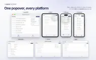
minikin.meA popover is a transient view that appears above other content onscreen when you tap a control or in an area.
import 'package:flutter/material.dart';
import 'package:popover/popover.dart';

import 'roadmap.dart';

void main() => runApp(const PopoverExample());

const playgroundTab = Key('playground-tab');

class PopoverExample extends StatefulWidget {
  const PopoverExample({super.key});

  @override
  State<PopoverExample> createState() => _PopoverExampleState();
}

ThemeData _theme(Brightness brightness) {
  final background = brightness == Brightness.light
      ? const Color(0xFFF7F7F8)
      : const Color(0xFF111113);
  return ThemeData(
    brightness: brightness,
    colorSchemeSeed: const Color(0xFF5E6AD2),
    scaffoldBackgroundColor: background,
    appBarTheme: AppBarTheme(
      backgroundColor: background,
      surfaceTintColor: Colors.transparent,
    ),
  );
}

class _PopoverExampleState extends State<PopoverExample> {
  var _tab = 0;

  @override
  Widget build(BuildContext context) {
    return MaterialApp(
      debugShowCheckedModeBanner: false,
      theme: _theme(Brightness.light),
      darkTheme: _theme(Brightness.dark),
      home: Scaffold(
        body: IndexedStack(
          index: _tab,
          children: const [RoadmapPage(), PlaygroundPage()],
        ),
        bottomNavigationBar: NavigationBar(
          selectedIndex: _tab,
          onDestinationSelected: (tab) => setState(() => _tab = tab),
          destinations: const [
            NavigationDestination(
              icon: Icon(Icons.view_agenda_outlined),
              label: 'Roadmap',
            ),
            NavigationDestination(
              key: playgroundTab,
              icon: Icon(Icons.grid_view),
              label: 'Playground',
            ),
          ],
        ),
      ),
    );
  }
}

/// Nine buttons across the screen to try how the popover flips, slides and
/// shrinks near the edges.
class PlaygroundPage extends StatefulWidget {
  const PlaygroundPage({super.key});

  @override
  State<PlaygroundPage> createState() => _PlaygroundPageState();
}

class _PlaygroundPageState extends State<PlaygroundPage> {
  var _direction = PopoverDirection.bottom;

  @override
  Widget build(BuildContext context) {
    final row = Row(
      mainAxisAlignment: MainAxisAlignment.spaceBetween,
      children: [for (var i = 0; i < 3; i++) Button(direction: _direction)],
    );
    return Scaffold(
      appBar: AppBar(
        title: const Text(
          'Playground',
          style: TextStyle(fontWeight: FontWeight.w600),
        ),
      ),
      body: SafeArea(
        child: Padding(
          padding: const EdgeInsets.fromLTRB(16, 4, 16, 8),
          child: Column(
            children: [
              SegmentedButton<PopoverDirection>(
                showSelectedIcon: false,
                segments: [
                  for (final direction in PopoverDirection.values)
                    ButtonSegment(
                      value: direction,
                      label: Text(direction.name),
                    ),
                ],
                selected: {_direction},
                onSelectionChanged: (selection) =>
                    setState(() => _direction = selection.single),
              ),
              const SizedBox(height: 8),
              Expanded(
                child: Column(
                  children: [
                    for (final alignment in const [
                      Alignment.topCenter,
                      Alignment.center,
                      Alignment.bottomCenter,
                    ])
                      Expanded(
                        child: Align(alignment: alignment, child: row),
                      ),
                  ],
                ),
              ),
            ],
          ),
        ),
      ),
    );
  }
}

class Button extends StatelessWidget {
  final PopoverDirection direction;

  const Button({required this.direction, super.key});

  @override
  Widget build(BuildContext context) {
    return OutlinedButton(
      style: OutlinedButton.styleFrom(
        backgroundColor: Theme.of(context).colorScheme.surfaceContainerLowest,
        minimumSize: const Size(80, 40),
      ),
      onPressed: () => showPopover(
        context: context,
        bodyBuilder: (context) =>
            const Material(type: MaterialType.transparency, child: ListItems()),
        onPop: () => debugPrint('Popover was popped'),
        direction: direction,
        style: const PopoverStyle(
          radius: 12,
          barrierColor: Color(0x14000000),
          arrowHeight: 15,
          arrowWidth: 30,
        ),
        width: 200,
        height: 360,
      ),
      child: const Text('Open'),
    );
  }
}

class ListItems extends StatelessWidget {
  const ListItems({super.key});

  static const _entries = ['A', 'B', 'C', 'D', 'E', 'F', 'G', 'H'];

  @override
  Widget build(BuildContext context) {
    return ListView.separated(
      padding: const EdgeInsets.all(8),
      itemCount: _entries.length,
      separatorBuilder: (_, _) => const SizedBox(height: 4),
      itemBuilder: (context, index) => ListTile(
        shape: RoundedRectangleBorder(borderRadius: BorderRadius.circular(8)),
        tileColor: Color.lerp(
          Theme.of(context).brightness == Brightness.light
              ? const Color(0xFFEEF0FC)
              : const Color(0xFF23263A),
          Theme.of(context).brightness == Brightness.light
              ? const Color(0xFFC9CDF3)
              : const Color(0xFF3A3F6B),
          index / (_entries.length - 1),
        ),
        title: Text('Entry ${_entries[index]}'),
        onTap: index == 0
            ? () => Navigator.of(context)
                ..pop()
                ..push(
                  MaterialPageRoute<void>(
                    builder: (context) => const SecondRoute(),
                  ),
                )
            : null,
      ),
    );
  }
}

class SecondRoute extends StatelessWidget {
  const SecondRoute({super.key});

  @override
  Widget build(BuildContext context) {
    return Scaffold(
      appBar: AppBar(
        title: const Text('Second Route'),
        automaticallyImplyLeading: false,
      ),
      body: Center(
        child: FilledButton(
          onPressed: () => Navigator.pop(context),
          child: const Text('Back'),
        ),
      ),
    );
  }
}Metadata
687
likes
160
points
39.8k
downloads

Documentation
Publisher
Weekly Downloads
Metadata
A popover is a transient view that appears above other content onscreen when you tap a control or in an area.
Repository (GitHub)
View/report issues
Contributing
Topics
#popover #tooltip #menu #ios #macos
License
 MIT (license)