sketchy_design_lang 0.4.0  sketchy_design_lang: ^0.4.0 copied to clipboard
 sellsbrothers.com
Sketchy is a hand-drawn, xkcd-inspired design language for Flutter on mobile, desktop, and web
Sketchy Design Language for Flutter #
Sketchy is a hand-drawn, xkcd-inspired design language for Flutter on mobile, desktop, and web. It's powered by the wired_elements code, the flutter_rough package and the Comic Shanns font.
Sketchy is a complete design language: a theming system, widget catalog, and
example gallery that avoids Material/Cupertino entirely. Every control is drawn
with rough_flutter, seeded primitives prevent flicker, and the palette mirrors
the Sketchy Mode color brief.
Look 'n' Feel #
Design System example #
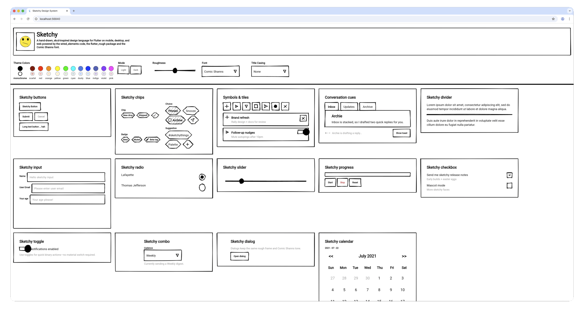
The is the output of the example app as a living design system overview. You can run this example app right now to get a feel for it yourself.
Chat example #
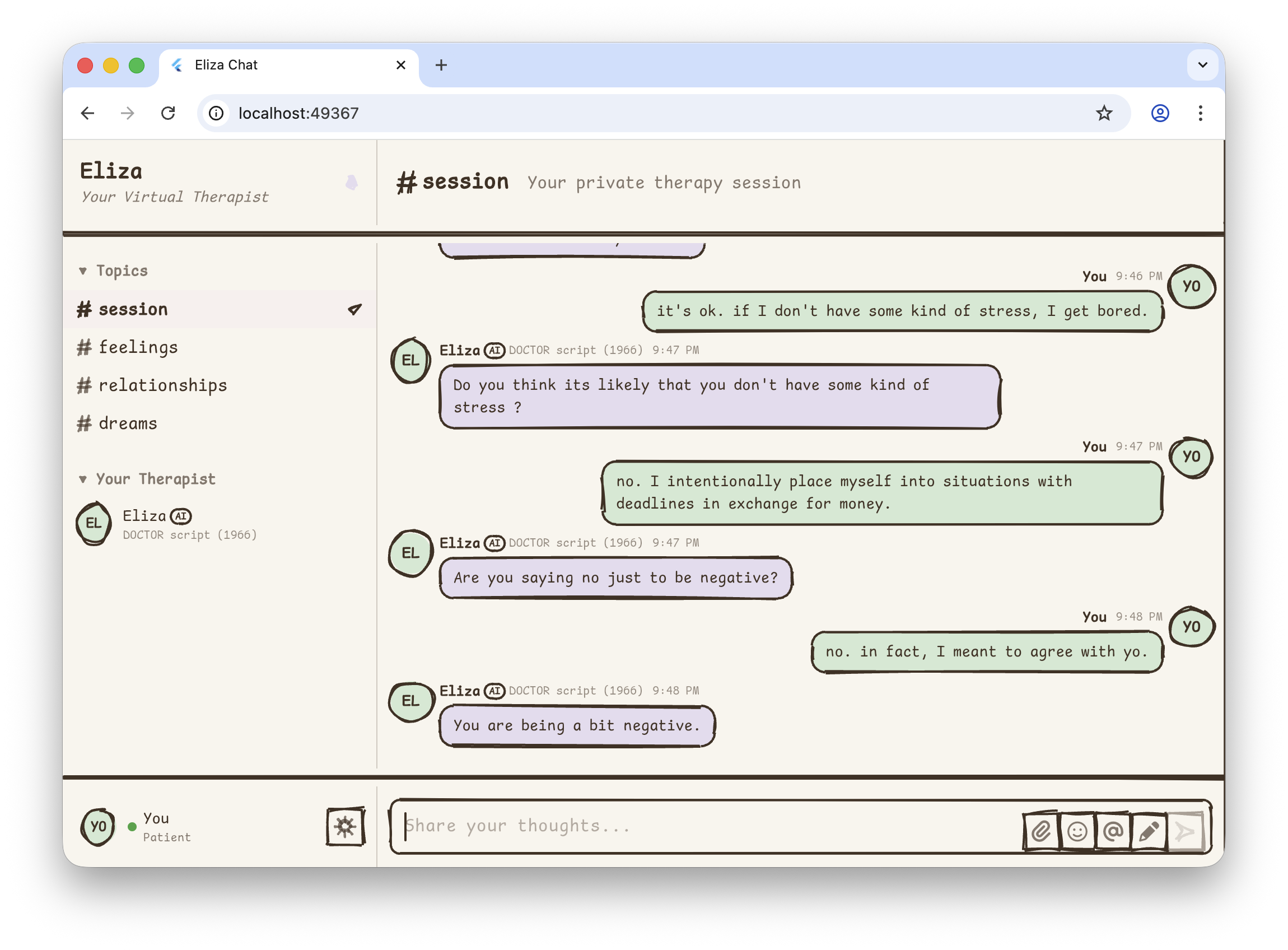
A virtual therapist chat app powered by the classic
ELIZA algorithm (1966). Features
therapy-themed channels, real-time responses, responsive two-panel layout with
full-width dividers, and new widgets like SketchyAvatar and SketchyDrawer.
Getting started #
Install #
Add Sketchy directly from git (temporarily) or via whatever source your project uses:
dependencies:
  sketchy_design_lang: ^latest-version
Then fetch packages:
flutter pub get
Minimal app #
import 'package:flutter/widgets.dart' hide Text;
import 'package:sketchy_design_lang/sketchy_design_lang.dart';

void main() => runApp(const SketchyDemo());

class SketchyDemo extends StatelessWidget {
  const SketchyDemo({super.key});

  @override
  Widget build(BuildContext context) {
    return SketchyApp(
      title: 'Sketchy Demo',
      theme: SketchyThemeData.fromTheme(
        SketchyThemes.blue,
        roughness: 0.7,
      ),
      themeMode: SketchyThemeMode.system,
      home: SketchyScaffold(
        appBar: SketchyAppBar(title: SketchyText('Wireframe Vibes')),
        body: Center(child: SketchyOutlinedButton(onPressed: () {}, child: SketchyText('Do the thing'))),
      ),
    );
  }
}
The entire widget tree now uses the Sketchy palette, typography, and primitives.
SketchyApp works like MaterialApp: provide a light theme, optionally a
darkTheme, and control themeMode (system, light, dark). When you omit
darkTheme, Sketchy auto-derives one by swapping ink/paper and
primary/secondary colors so dark mode still feels native without extra setup.
Core concepts #
Theme data #
SketchyThemeData carries:
- Colors – ink, paper, primary/secondary, error. Themes include monochrome plus Red → Violet families. Dark mode swaps ink/paper automatically.
- Roughness – a 0–1 dial that controls wobble, bowing, hachure spacing, and randomness (0 = crisp, 1 = sketchbook chaos).
- Typography – defaults to Comic Shanns but you can swap entire families via
copyWith. - TextCase – transforms all text display (labels, headers, tooltips, etc.)
with four options:
none(default),allCaps,titleCase,allLower. Does NOT affect actual user input. For maximum sketchy vibes, tryxkcdfont +TextCase.allCaps. - Stroke width & border radius – consistent outlines for every widget.
Access the theme with SketchyTheme.of(context) or the consumer pattern
SketchyTheme.consumer(). Granular helpers like SketchyTypography.of(context)
are also available, though theme.typography via the consumer is preferred.
Traditional pattern:
final theme = SketchyTheme.of(context);
return SketchyText('Hello', style: TextStyle(color: theme.inkColor));
Consumer pattern (recommended):
return SketchyTheme.consumer(
  builder: (context, theme) => SketchyText(
    'Hello',
    style: TextStyle(color: theme.inkColor),
  ),
);
The consumer pattern provides cleaner access to both theme and typography without multiple lookups, and rebuilds automatically when the theme changes.
Primitives & surfaces #
At the core are SketchyPrimitive, SketchySurface, and SketchyFrame:
- Primitive caches draw seeds so shapes remain stable between frames.
- Surface paints a primitive behind any child widget.
- Frame is a convenience wrapper for rectangles/circles/pills with padding and alignment.
Use these to build custom Sketchy components without touching low-level rough APIs.
Roughness-aware fills #
The library exposes SketchyFillOptions so you can control hachure gaps or line
weights (e.g., the progress bar uses denser fills for stronger contrast). Most
widgets read the theme roughness and adapt automatically.
Isolated Material usage #
While Sketchy is designed to be independent of Material, SketchyApp and
SketchyTextField use isolated Material contexts internally to provide advanced
text editing capabilities (like selection handles, cursors, and clipboard
access) without leaking Material styles into your app. You do not need to
wrap your app in MaterialApp or Theme; SketchyApp handles the necessary
localization delegates automatically.
Using Sketchy widgets #
Sketchy mirrors common UI building blocks. Highlights:
| Category | Widgets |
|---|---|
| Inputs | SketchyTextField, SketchyDropdownButton, SketchySlider, SketchyCheckbox, SketchySwitch, SketchyRadio, SketchyCheckboxListTile, SketchyRadioListTile |
| Actions | SketchyOutlinedButton, SketchyButton, SketchyIconButton, SketchyChip |
| Icons | SketchySymbol, SketchyAvatar |
| Containers | SketchyCard, SketchyListTile, SketchyDivider, SketchyDrawer |
| Progress | SketchyLinearProgressIndicator, SketchyCircularProgressIndicator |
| Feedback | SketchyDialog, SketchyTooltip, SketchyChip, SketchyTypingIndicator, SketchySnackBar |
| Navigation | SketchyTabBar, SketchyAppBar, SketchyScaffold |
Quick examples #
SketchyOutlinedButton(
  onPressed: saveNote,
  child: SketchyText('Save', style: SketchyTheme.of(context).typography.label),
);

SketchyCheckboxListTile(
  value: wantsEmails,
  onChanged: (checked) =>
      setState(() => wantsEmails = checked ?? wantsEmails),
  title: SketchyText('Email me weekly',
      style: SketchyTheme.of(context).typography.body),
  subtitle: const SketchyText('Includes product updates + comics.'),
);

SketchyRadioListTile<String>(
  value: 'instant',
  groupValue: deliverySpeed,
  onChanged: (value) => setState(() => deliverySpeed = value ?? 'instant'),
  title: SketchyText('Send instantly',
      style: SketchyTheme.of(context).typography.body),
);

// `SketchyCheckboxListTile` and `SketchyRadioListTile` keep the control and its label (any widget)
// in sync and makes the entire row tappable.

SketchySlider(
  value: roughness,
  onChanged: (value) => setState(() => roughness = value),
  min: 0,
  max: 1,
);

// Linear progress indicator (determinate mode)
SketchyLinearProgressIndicator(
  value: 0.65,
  color: Colors.blue,
  backgroundColor: Colors.grey.shade200,
  minHeight: 20,
);

// Linear progress indicator (indeterminate mode)
SketchyLinearProgressIndicator(
  controller: animationController,
  color: theme.primaryColor,
);

// Circular progress indicator (determinate mode)
SketchyCircularProgressIndicator(
  value: 0.75,
  size: 48,
  strokeWidth: 4.0,
  color: Colors.green,
);

// Circular progress indicator (indeterminate mode)
SketchyCircularProgressIndicator(
  size: 64,
  color: theme.secondaryColor,
);

SketchyDialog(
  child: Column(
    crossAxisAlignment: CrossAxisAlignment.start,
    mainAxisSize: MainAxisSize.min,
    children: [
      SketchyText('Plan review', style: SketchyTheme.of(context).typography.title),
      const SizedBox(height: 16),
      const SketchyText('Update palette + capture perf traces.'),
      Align(
        alignment: Alignment.centerRight,
        child: SketchyOutlinedButton(
          onPressed: Navigator.of(context).pop,
          child: const SketchyText('Close'),
        ),
      ),
    ],
  ),
);
Every widget respects the active SketchyTheme—colors swap immediately when you
change modes, and the roughness slider affects outlines/fills at once.
Contributing #
- Fork + branch from
mainorrearchitect. - Add or update widgets inside
lib/src/widgets/. Re-export throughlib/src/widgets/widgets.dart. - Update the gallery and specs when introducing new components or significant behavior changes.
- Run analyzer + tests before opening a PR.
- Document any new APIs in this README and in the specs folder.
Ideas? Bug reports? Open an issue! We love seeing new rough widgets, color modes, and theme experiments. Let's keep wireframes fun. ✍️
Acknowledgements #
- wired_elements – MIT License. The original hand-drawn widget kit that inspired Sketchy!
- rough_flutter – MIT License. Fork of the rough renderer that powers Sketchy primitives.
- Comic Shanns font – MIT License. The typeface bundled with Sketchy by default.
Metadata
Publisher
Weekly Downloads
Metadata
Sketchy is a hand-drawn, xkcd-inspired design language for Flutter on mobile, desktop, and web
Repository (GitHub)
View/report issues
Documentation
License
 BSD-3-Clause (license)