timely_x 2.0.2  timely_x: ^2.0.2 copied to clipboard
A professional calendar library for Flutter with multi-resource scheduling and comprehensive customization.
TimelyX #
A powerful, flexible, and highly customizable calendar widget for Flutter that displays appointments across multiple resources (people, rooms, equipment, etc.) in day, week, and month views.

Perfect for scheduling applications, appointment systems, resource management, team calendars, and any scenario where you need to visualize time-based data across multiple entities.
✨ Features #
Core Features #
- 📅 Multiple View Types: Day, Week, and Month views
- 👥 Multi-Resource Support: Display appointments for multiple people, rooms, or resources
- 🎨 Fully Customizable: 65+ theme properties for complete design control
- 🖱️ Rich Interactions: Tap, long-press, drag & drop, resize appointments
- 📱 Responsive: Works beautifully on mobile, tablet, and desktop
- 🎯 Flexible Layouts: Resources-first or days-first week view layouts
- ⚡ High Performance: Optimized rendering for smooth scrolling
- 🌐 Internationalization: Customizable date formats for any locale
Appointment Features #
- ⏰ Real-time current time indicator
- 🔄 Drag and drop appointments between resources and time slots
- 📏 Resize appointments to change duration
- 🎨 Custom colors per appointment
- 📝 Title, subtitle, and custom data support
- ⚠️ Overlap detection and intelligent positioning
- 🚫 Conflict prevention (optional)
UI Features #
- 🌈 Weekend highlighting
- 📍 Today indicator
- 🎯 Selection states
- 🖱️ Hover effects
- 🌓 Dark mode support
- ♿ Accessibility ready
- 📐 Zebra striping for better readability
- 🎨 Customizable grid, headers, and time columns
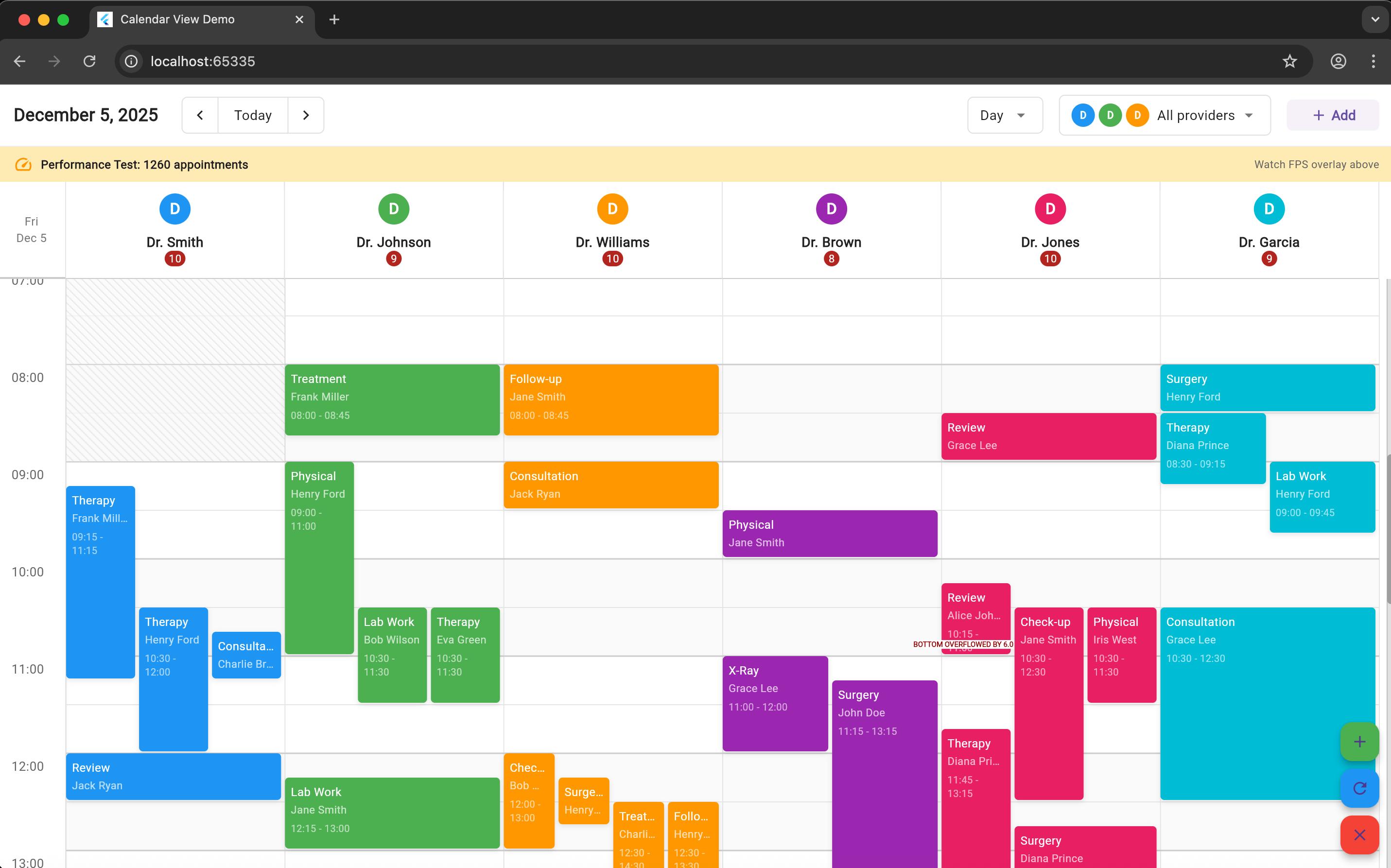
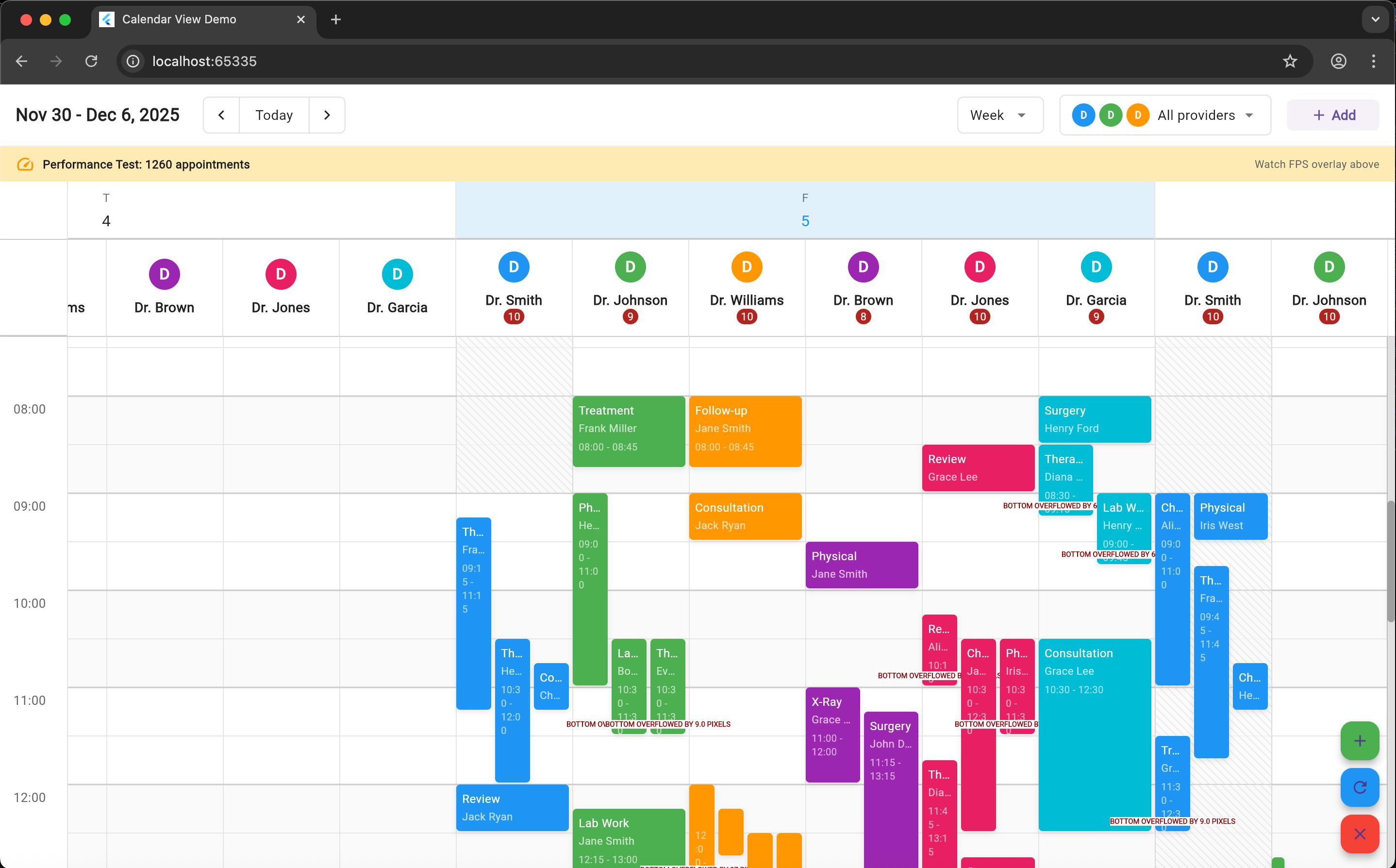
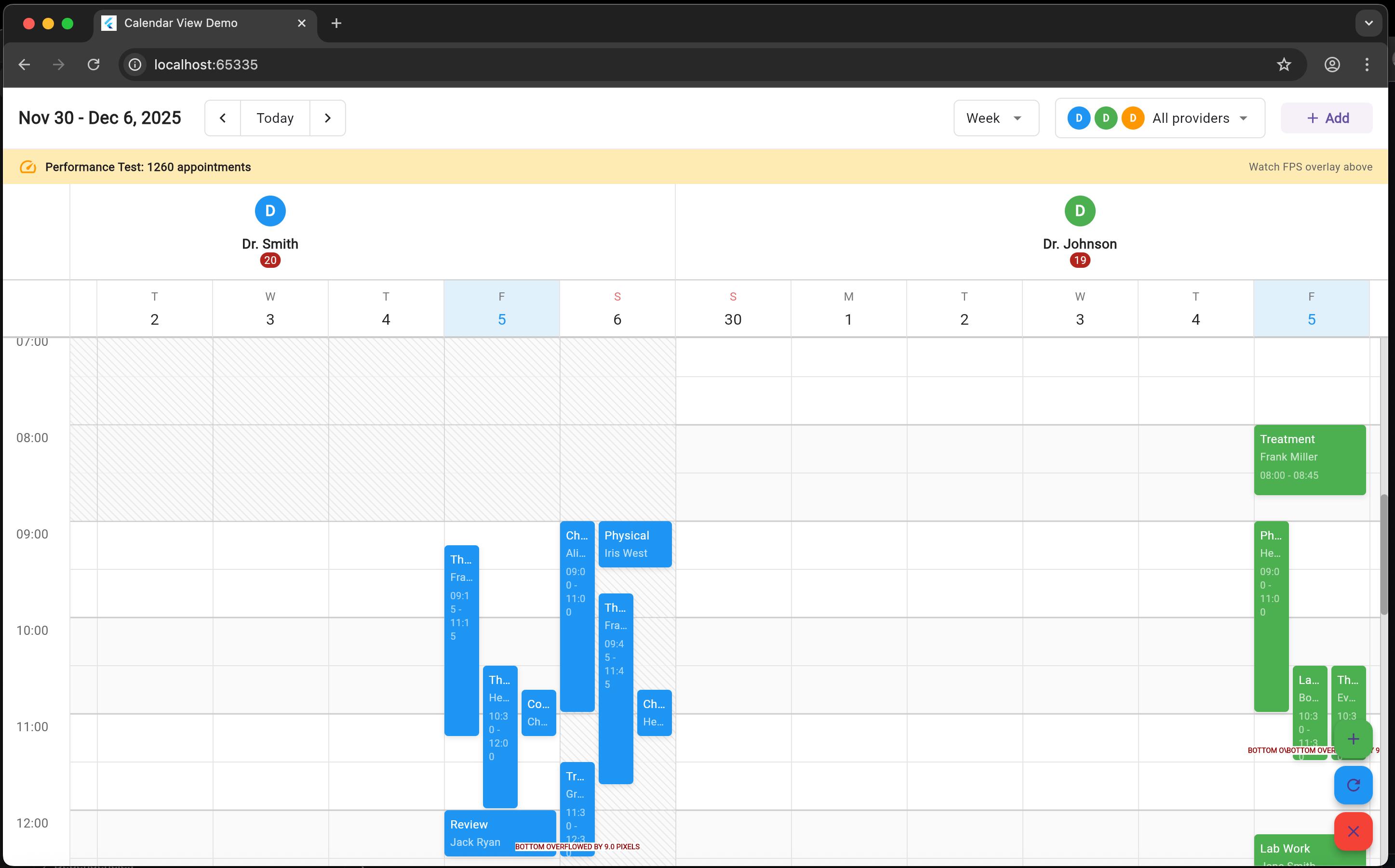
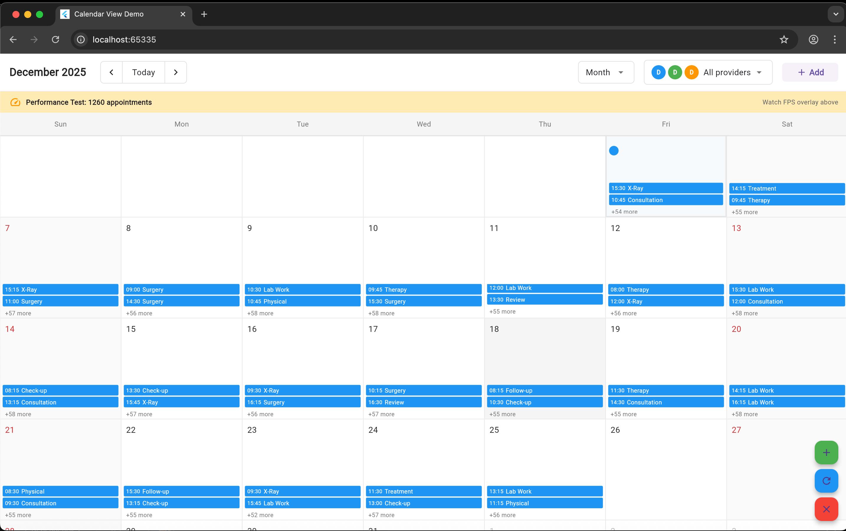
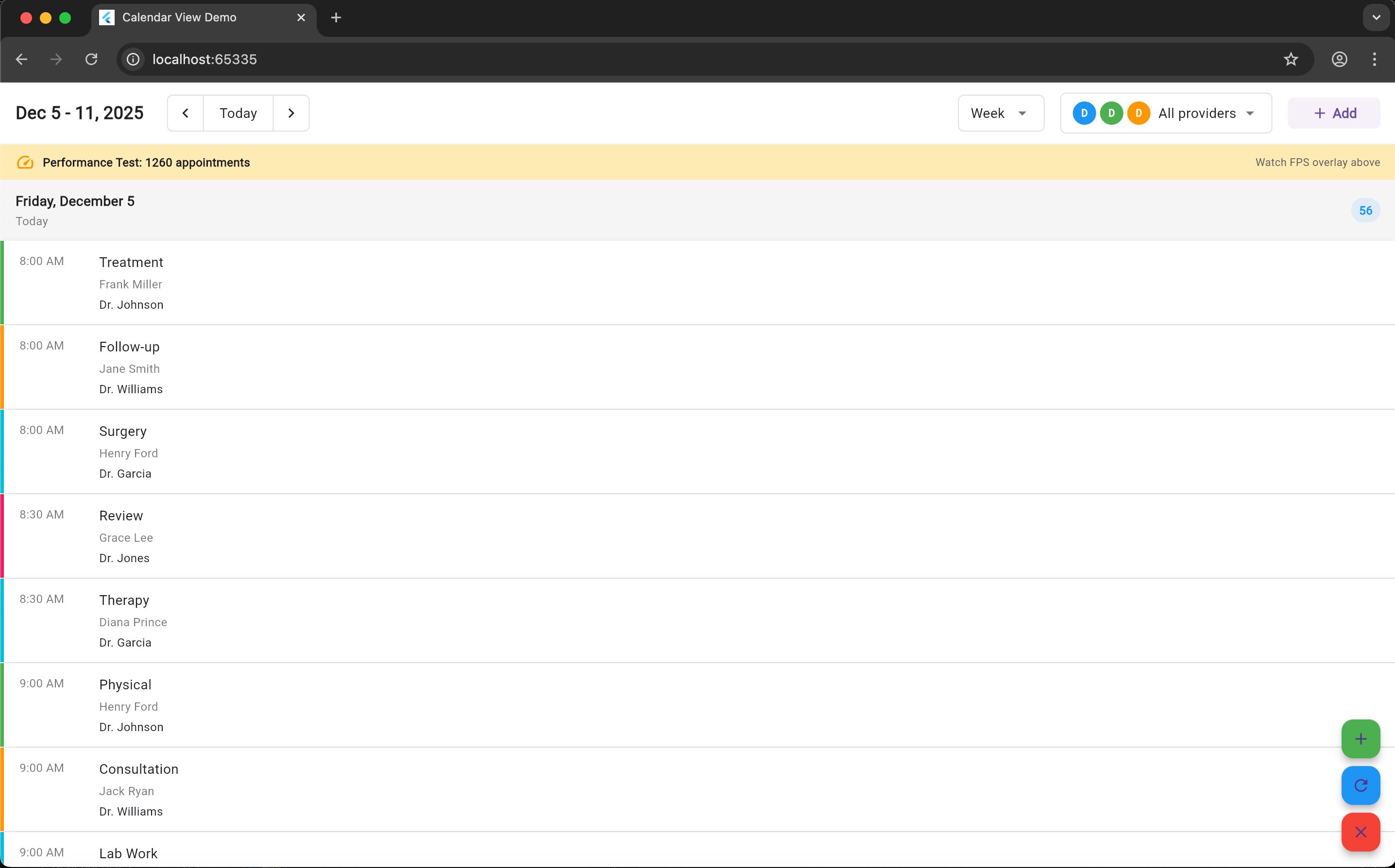
📸 Screenshots #
Day View #
Shows all resources for a single day — perfect for detailed scheduling.
Week View #
Your standard weekly layout.
Week View – Resources First #
Displays each resource across the week — ideal for team scheduling.
Month View #
A monthly overview with appointment summaries.
Agenda View #
A vertical list of appointments across days.
🚀 Getting Started #
Installation #
Add this to your package's pubspec.yaml file:
dependencies:
  timely_x: latest
  intl: ^0.18.0  # Required for date formatting
Then run:
flutter pub get
Basic Usage #
import 'package:flutter/material.dart';
import 'package:timely_x/timely_x.dart';

class MyCalendar extends StatefulWidget {
  @override
  _MyCalendarState createState() => _MyCalendarState();
}

class _MyCalendarState extends State<MyCalendar> {
  late CalendarController _controller;

  @override
  void initState() {
    super.initState();

    // Initialize controller
    _controller = CalendarController(
      config: CalendarConfig(
        viewType: CalendarViewType.week,
        hourHeight: 100,
        dayStartHour: 8,
        dayEndHour: 18,
      ),
    );

    // Add resources
    _controller.updateResources([
      DefaultResource(
        id: '1',
        name: 'John Doe',
        color: Colors.blue,
      ),
      DefaultResource(
        id: '2',
        name: 'Jane Smith',
        color: Colors.green,
      ),
    ]);

    // Add appointments
    _controller.updateAppointments([
      DefaultAppointment(
        id: 'apt1',
        resourceId: '1',
        title: 'Team Meeting',
        startTime: DateTime.now().add(Duration(hours: 1)),
        endTime: DateTime.now().add(Duration(hours: 2)),
        color: Colors.blue,
      ),
    ]);
  }

  @override
  void dispose() {
    _controller.dispose();
    super.dispose();
  }

  @override
  Widget build(BuildContext context) {
    return Scaffold(
      appBar: AppBar(
        title: Text('My Calendar'),
        actions: [
          IconButton(
            icon: Icon(Icons.today),
            onPressed: () => _controller.goToToday(),
          ),
        ],
      ),
      body: CalendarView(
        controller: _controller,
        onAppointmentTap: (data) {
          print('Tapped: ${data.appointment.title}');
        },
        onCellTap: (data) {
          print('Cell tapped at ${data.dateTime}');
        },
      ),
    );
  }
}
📖 Core Concepts #
1. CalendarController #
The controller manages the calendar state:
final controller = CalendarController(
  initialDate: DateTime.now(),
  config: CalendarConfig(
    viewType: CalendarViewType.week,
    hourHeight: 100,
    dayStartHour: 8,
    dayEndHour: 18,
  ),
);

// Navigation
controller.next();           // Go to next period
controller.previous();        // Go to previous period
controller.goToToday();       // Jump to today
controller.goToDate(date);    // Jump to specific date

// Data management
controller.updateResources(resources);
controller.updateAppointments(appointments);
controller.addAppointment(appointment);
controller.removeAppointment(id);

// View type switching
controller.setViewType(CalendarViewType.day);
controller.setViewType(CalendarViewType.week);
controller.setViewType(CalendarViewType.month);
2. Resources #
Resources represent the entities (people, rooms, etc.) for which appointments are scheduled:
// Using the default implementation
final resource = DefaultResource(
  id: 'user1',
  name: 'John Doe',
  avatarUrl: 'https://example.com/avatar.jpg',
  color: Colors.blue,
  category: 'Engineering',
  isActive: true,
);

// Or create your own by extending CalendarResource
class Employee extends CalendarResource {
  final String department;
  final String email;

  Employee({
    required String id,
    required String name,
    required this.department,
    required this.email,
  });

  @override
  String get id => id;

  @override
  String get name => name;
}
3. Appointments #
Appointments represent scheduled events:
// Using the default implementation
final appointment = DefaultAppointment(
  id: 'apt1',
  resourceId: 'user1',
  title: 'Team Meeting',
  subtitle: 'Quarterly Review',
  startTime: DateTime(2025, 11, 18, 14, 0),
  endTime: DateTime(2025, 11, 18, 15, 30),
  color: Colors.blue,
  status: 'confirmed',
  customData: {'location': 'Room 101'},
);

// Or create your own by extending CalendarAppointment
class Meeting extends CalendarAppointment {
  final String location;
  final List<String> attendees;

  Meeting({
    required String id,
    required String resourceId,
    required String title,
    required DateTime startTime,
    required DateTime endTime,
    required this.location,
    required this.attendees,
  });

  @override
  String get id => id;

  @override
  String get resourceId => resourceId;

  @override
  String get title => title;

  @override
  DateTime get startTime => startTime;

  @override
  DateTime get endTime => endTime;
}
4. Configuration #
Fine-tune the calendar behavior:
final config = CalendarConfig(
  viewType: CalendarViewType.week,
  weekViewLayout: WeekViewLayout.resourcesFirst,

  // Time range
  dayStartHour: 8,
  dayEndHour: 18,

  // Sizing
  hourHeight: 100.0,
  minColumnWidth: 120.0,
  maxColumnWidth: 300.0,
  preferredColumnWidth: 180.0,

  // Snap behavior
  enableSnapping: true,
  snapToMinutes: 15,
  timeSlotDuration: Duration(minutes: 30),

  // Features
  enableDragAndDrop: true,
  enableResize: true,
  allowOverlapping: true,
  maxOverlaps: 4,
  showWeekends: true,
);
🎨 Customization #
The calendar is fully customizable with 65+ theme properties. Here's a quick example:
CalendarView(
  controller: controller,
  theme: CalendarTheme(
    // Colors
    todayHighlightColor: Colors.purple,
    currentTimeIndicatorColor: Colors.orange,
    weekendColor: Color(0xFFFFF3E0),
    weekendTextColor: Colors.deepOrange,

    // Text styles
    timeTextStyle: TextStyle(
      fontSize: 12,
      fontWeight: FontWeight.w500,
      color: Colors.grey[700],
    ),
    appointmentTextStyle: TextStyle(
      fontSize: 14,
      fontWeight: FontWeight.w600,
      color: Colors.white,
    ),

    // Date formats
    timeFormat: 'h:mm a',              // 12-hour format
    dateFormat: 'dd',                  // Two-digit day
    weekdayFormat: 'EEEE',             // Full weekday name

    // Spacing
    appointmentPadding: EdgeInsets.all(8),
    appointmentMargin: EdgeInsets.only(right: 4, bottom: 2),
    resourceAvatarRadius: 24.0,

    // Decorations
    appointmentBorderRadius: 12.0,
    appointmentShadow: [
      BoxShadow(
        color: Colors.black26,
        blurRadius: 8,
        offset: Offset(0, 4),
      ),
    ],
  ),
)
Theming Examples #
Dark Mode
CalendarTheme(
  gridBackgroundColor: Color(0xFF121212),
  headerBackgroundColor: Color(0xFF1E1E1E),
  timeColumnBackgroundColor: Color(0xFF1E1E1E),
  gridLineColor: Color(0xFF424242),
  hourLineColor: Color(0xFF616161),
  timeTextStyle: TextStyle(color: Color(0xFFB0B0B0)),
  dateTextStyle: TextStyle(color: Color(0xFFE0E0E0)),
)
Compact Mobile
CalendarTheme(
  resourceHeaderPadding: EdgeInsets.all(8),
  appointmentPadding: EdgeInsets.all(2),
  resourceAvatarRadius: 16.0,
  timeTextStyle: TextStyle(fontSize: 11),
  appointmentSpacing: 1.0,
)
European Locale
CalendarTheme(
  timeFormat: 'HH:mm',                      // 24-hour
  dateHeaderFormat: 'd MMMM yyyy',          // 18 November 2025
  weekdayFormat: 'EEEE',                    // Monday
  monthFormat: 'MMMM yyyy',                 // November 2025
)
📚 For complete customization documentation, see:
- CUSTOMIZATION_GUIDE.md - Full customization guide
- THEME_QUICK_REFERENCE.md - Quick reference cheat sheet
🔧 Advanced Features #
Custom Builders #
Replace default widgets with your own:
CalendarView(
  controller: controller,

  // Custom resource header
  resourceHeaderBuilder: (context, resource, width, isHovered) {
    return Container(
      width: width,
      padding: EdgeInsets.all(12),
      child: Column(
        children: [
          Icon(Icons.person, size: 32),
          SizedBox(height: 8),
          Text(resource.name, style: TextStyle(fontWeight: FontWeight.bold)),
          Text('Available', style: TextStyle(fontSize: 10, color: Colors.green)),
        ],
      ),
    );
  },

  // Custom appointment widget
  appointmentBuilder: (context, appointment, resource, rect, isSelected) {
    return Container(
      decoration: BoxDecoration(
        gradient: LinearGradient(
          colors: [appointment.color, appointment.color.withOpacity(0.7)],
        ),
        borderRadius: BorderRadius.circular(8),
      ),
      padding: EdgeInsets.all(8),
      child: Column(
        crossAxisAlignment: CrossAxisAlignment.start,
        children: [
          Text(appointment.title, style: TextStyle(fontWeight: FontWeight.bold)),
          Text('with ${resource.name}'),
        ],
      ),
    );
  },

  // Custom time labels
  timeColumnBuilder: (context, time, height, isHourMark) {
    if (!isHourMark) return SizedBox.shrink();
    return Container(
      height: height,
      alignment: Alignment.topRight,
      padding: EdgeInsets.only(right: 8, top: 4),
      child: Text(
        DateFormat('h a').format(time),
        style: TextStyle(fontSize: 11, color: Colors.grey),
      ),
    );
  },
)
Event Callbacks #
Handle user interactions:
CalendarView(
  controller: controller,

  // Appointment interactions
  onAppointmentTap: (data) {
    showDialog(
      context: context,
      builder: (context) => AppointmentDialog(appointment: data.appointment),
    );
  },

  onAppointmentLongPress: (data) {
    showModalBottomSheet(
      context: context,
      builder: (context) => AppointmentOptions(appointment: data.appointment),
    );
  },

  onAppointmentSecondaryTap: (data) {
    // Right-click or long-press
    showContextMenu(context, data);
  },

  // Drag and drop
  onAppointmentDragEnd: (data) {
    // Update appointment with new time/resource
    final updatedAppointment = data.appointment.copyWith(
      resourceId: data.newResource.id,
      startTime: data.newStartTime,
      endTime: data.newEndTime,
    );
    controller.updateAppointment(updatedAppointment);
  },

  // Cell interactions
  onCellTap: (data) {
    // Create new appointment
    createAppointment(
      resource: data.resource,
      startTime: data.dateTime,
    );
  },

  onCellLongPress: (data) {
    // Show quick create dialog
    showQuickCreateDialog(context, data);
  },

  // Header interactions
  onResourceHeaderTap: (data) {
    showResourceDetails(data.resource);
  },

  onDateHeaderTap: (data) {
    controller.goToDate(data.date);
  },
)
Drag and Drop #
Full drag and drop support with customizable behavior:
CalendarConfig(
  enableDragAndDrop: true,
  enableResize: true,
  enableSnapping: true,
  snapToMinutes: 15,
  allowOverlapping: true,
)

// Handle the drop
onAppointmentDragEnd: (data) {
  // Check for conflicts
  if (!controller.isTimeSlotAvailable(
    resourceId: data.newResource.id,
    startTime: data.newStartTime,
    endTime: data.newEndTime,
    excludeAppointmentId: data.appointment.id,
  )) {
    // Show conflict warning
    showConflictDialog();
    return;
  }

  // Update appointment
  final updated = data.appointment.copyWith(
    resourceId: data.newResource.id,
    startTime: data.newStartTime,
    endTime: data.newEndTime,
  );

  controller.updateAppointment(updated);

  // Optionally save to backend
  saveToBackend(updated);
}
Conflict Detection #
Prevent or warn about scheduling conflicts:
// Check availability before creating appointment
bool canSchedule = controller.isTimeSlotAvailable(
  resourceId: 'user1',
  startTime: proposedStart,
  endTime: proposedEnd,
);

if (!canSchedule) {
  showDialog(
    context: context,
    builder: (context) => AlertDialog(
      title: Text('Scheduling Conflict'),
      content: Text('This time slot is already booked.'),
      actions: [
        TextButton(
          onPressed: () => Navigator.pop(context),
          child: Text('OK'),
        ),
      ],
    ),
  );
  return;
}

// Create appointment
controller.addAppointment(newAppointment);
View Switching #
Seamlessly switch between different views:
Row(
  children: [
    TextButton(
      onPressed: () => controller.setViewType(CalendarViewType.day),
      child: Text('Day'),
    ),
    TextButton(
      onPressed: () => controller.setViewType(CalendarViewType.week),
      child: Text('Week'),
    ),
    TextButton(
      onPressed: () => controller.setViewType(CalendarViewType.month),
      child: Text('Month'),
    ),
  ],
)
Week View Layouts #
Choose between two layout modes:
// Resources first (default): Resource1[Day1, Day2...], Resource2[Day1, Day2...]
CalendarConfig(
  weekViewLayout: WeekViewLayout.resourcesFirst,
)

// Days first: Day1[Resource1, Resource2...], Day2[Resource1, Resource2...]
CalendarConfig(
  weekViewLayout: WeekViewLayout.daysFirst,
)
📱 Responsive Design #
The calendar automatically adapts to different screen sizes:
LayoutBuilder(
  builder: (context, constraints) {
    final isMobile = constraints.maxWidth < 600;
    final isTablet = constraints.maxWidth >= 600 && constraints.maxWidth < 1024;

    return CalendarView(
      controller: controller,
      config: CalendarConfig(
        minColumnWidth: isMobile ? 100 : 120,
        preferredColumnWidth: isMobile ? 150 : 180,
        hourHeight: isMobile ? 80 : 100,
      ),
      theme: CalendarTheme(
        appointmentPadding: isMobile
          ? EdgeInsets.all(2)
          : EdgeInsets.all(4),
        resourceAvatarRadius: isMobile ? 16 : 20,
      ),
    );
  },
)
🌐 Internationalization #
Support any locale with custom date formats:
// German locale
CalendarTheme(
  timeFormat: 'HH:mm',
  dateFormat: 'd.',
  weekdayFormat: 'EEEE',
  dateHeaderFormat: 'd. MMMM yyyy',
  monthFormat: 'MMMM yyyy',
)

// Japanese locale
CalendarTheme(
  timeFormat: 'H:mm',
  dateFormat: 'd日',
  weekdayFormat: 'EEEE',
  dateHeaderFormat: 'yyyy年M月d日',
  monthFormat: 'yyyy年M月',
)

// Spanish locale
CalendarTheme(
  timeFormat: 'H:mm',
  dateFormat: 'd',
  weekdayFormat: 'EEEE',
  dateHeaderFormat: "d 'de' MMMM 'de' yyyy",
  monthFormat: "MMMM 'de' yyyy",
)
📊 Performance Tips #
- Use const constructors when possible:
const CalendarTheme(/* ... */)
- Reuse theme instances:
final myTheme = CalendarTheme(/* ... */);

// Reuse across multiple widgets
CalendarView(theme: myTheme)
- Limit visible appointments in month view:
CalendarTheme(
  monthViewMaxVisibleAppointments: 3,
)
- Use efficient data structures:
// Good: Update all at once
controller.updateAppointments(allAppointments);

// Avoid: Multiple individual updates in a loop
for (var apt in appointments) {
  controller.addAppointment(apt); // Triggers rebuild each time
}
🧪 Testing #
Example test setup:
testWidgets('Calendar displays appointments', (tester) async {
  final controller = CalendarController(
    config: CalendarConfig(viewType: CalendarViewType.week),
  );

  controller.updateResources([
    DefaultResource(id: '1', name: 'Test User'),
  ]);

  controller.updateAppointments([
    DefaultAppointment(
      id: 'apt1',
      resourceId: '1',
      title: 'Test Meeting',
      startTime: DateTime.now(),
      endTime: DateTime.now().add(Duration(hours: 1)),
    ),
  ]);

  await tester.pumpWidget(
    MaterialApp(
      home: Scaffold(
        body: CalendarView(controller: controller),
      ),
    ),
  );

  expect(find.text('Test Meeting'), findsOneWidget);

  controller.dispose();
});
📚 API Reference #
CalendarView #
Main calendar widget that displays appointments across resources.
Properties:
controller(CalendarController, required) - Controls calendar stateconfig(CalendarConfig) - Configuration optionstheme(CalendarTheme) - Visual customizationresourceHeaderBuilder- Custom resource header widgetdateHeaderBuilder- Custom date header widgettimeColumnBuilder- Custom time column widgetappointmentBuilder- Custom appointment widgetemptyCellBuilder- Custom empty cell widgetcurrentTimeIndicatorBuilder- Custom time indicatoronAppointmentTap- Appointment tap callbackonAppointmentLongPress- Appointment long press callbackonAppointmentSecondaryTap- Appointment right-click callbackonCellTap- Cell tap callbackonCellLongPress- Cell long press callbackonAppointmentDragEnd- Drag end callbackonResourceHeaderTap- Resource header tap callbackonDateHeaderTap- Date header tap callback
CalendarController #
Manages calendar state and data.
Constructor:
CalendarController({
  DateTime? initialDate,
  required CalendarConfig config,
})
Properties:
currentDate(DateTime) - Currently displayed dateviewType(CalendarViewType) - Current view typevisibleDates(Listresources(Listappointments(ListselectedAppointment(CalendarAppointment?) - Selected appointment
Methods:
next()- Navigate to next periodprevious()- Navigate to previous periodgoToToday()- Jump to todaygoToDate(DateTime)- Jump to specific datesetViewType(CalendarViewType)- Change view typeupdateResources(List<CalendarResource>)- Update resourcesupdateAppointments(List<CalendarAppointment>)- Update appointmentsaddAppointment(CalendarAppointment)- Add single appointmentupdateAppointment(CalendarAppointment)- Update appointmentremoveAppointment(String)- Remove appointment by IDselectAppointment(CalendarAppointment?)- Select appointmentgetAppointmentsForResourceDate(String, DateTime)- Get appointmentsisTimeSlotAvailable(...)- Check availabilitygetViewPeriodDescription()- Get current period text
CalendarConfig #
Configuration for calendar behavior.
Properties:
viewType(CalendarViewType) - View type (day/week/month)weekViewLayout(WeekViewLayout) - Week view layout modedayStartHour(int) - Start hour (0-23)dayEndHour(int) - End hour (1-24)hourHeight(double) - Height of each hour in pixelsminColumnWidth(double) - Minimum column widthmaxColumnWidth(double) - Maximum column widthpreferredColumnWidth(double) - Preferred column widthtimeColumnWidth(double) - Time column widthresourceHeaderHeight(double) - Resource header heightdateHeaderHeight(double) - Date header heighttimeSlotDuration(Duration) - Time slot durationshowWeekends(bool) - Show weekendsenableSnapping(bool) - Enable time snappingsnapToMinutes(int) - Snap to nearest X minutesenableDragAndDrop(bool) - Enable drag and dropenableResize(bool) - Enable resizeallowOverlapping(bool) - Allow overlapping appointmentsmaxOverlaps(int) - Maximum overlaps
CalendarTheme #
Visual customization with 65+ properties. See CUSTOMIZATION_GUIDE.md for complete reference.
🤝 Contributing #
Contributions are welcome! Please read our Contributing Guidelines before submitting a PR.
Development Setup #
# Clone the repository
git clone https://github.com/loicgeek/timely_x.git

# Get dependencies
flutter pub get

# Run tests
flutter test

# Run example
cd example
flutter run
Reporting Issues #
Please use the issue tracker to report bugs or request features.
📝 Examples #
Check out the /example directory for complete working examples:
- Basic Calendar - Simple setup with minimal configuration
- Custom Theme - Dark mode and custom styling
- Drag and Drop - Full drag and drop implementation
- Custom Builders - Custom widgets for all components
- Multi-Resource - Large-scale resource management
- Mobile Responsive - Responsive design patterns
- Localization - Multiple locale examples
Run the example app:
cd example
flutter run
🎯 Use Cases #
This calendar is perfect for:
- 👥 Team Scheduling - Schedule meetings across team members
- 🏨 Room Booking - Manage conference room reservations
- 🏥 Medical Appointments - Doctor scheduling systems
- 💈 Service Booking - Salon, spa, or service appointments
- 🎓 Class Scheduling - School or training schedules
- 🚗 Vehicle Management - Fleet or rental car scheduling
- 🏋️ Gym Classes - Fitness class and trainer scheduling
- 🎪 Event Planning - Event and venue management
📄 License #
This project is licensed under the MIT License - see the LICENSE file for details.
🙏 Acknowledgments #
- Built with Flutter
- Uses the intl package for internationalization
- Inspired by popular calendar libraries across platforms
📞 Support #
- 📧 Email: [email protected]
- 🐛 Issues: GitHub Issues
- 📖 Documentation: Full docs
🗺️ Roadmap #
- ❌ All-day events section
- ❌ Recurring appointments
- ❌ Export to iCal/CSV
- ❌ Timezone support
- ❌ Agenda view
- ❌ Resource grouping/filtering
- ❌ Search and filters
- ❌ Appointment templates
- ❌ Accessibility improvements
- ❌ More theme presets
⭐ Star History #
If you find this package useful, please consider giving it a star on GitHub!
Made with ❤️ by Loic Ngou
Metadata
Publisher
unverified uploader
Weekly Downloads
Metadata
A professional calendar library for Flutter with multi-resource scheduling and comprehensive customization.
Repository (GitHub)
View/report issues
Documentation
License
 MIT (license)
Dependencies
flutter, flutter_web_plugins, intl, plugin_platform_interface, web
More
Packages that depend on timely_x
Packages that implement timely_x