
settings_ui 4.0.0  settings_ui: ^4.0.0 copied to clipboard
Published 22 hours ago •  yako.dev
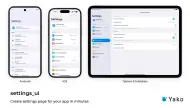
yako.devSettings screens that look native on iOS, Android, macOS, Windows, Linux (GNOME) and the web, from one API, with sub-pages and a split view for tablets and desktop.
4.0.0 [September 25, 2026] #
Breaking changes #
- Migrated from
package:flutter/material.dartandpackage:flutter/cupertino.dartto the decoupledmaterial_uiandcupertino_uipackages (#207, thanks @SlayerOrnstein) - Requires Flutter >=3.44.0 and Dart SDK >=3.12.0
- Your app must use
MaterialApp/CupertinoAppfrommaterial_ui/cupertino_ui. In an app still onpackage:flutter/material.dart,SettingsListcan't read your theme and falls back to default colors and light mode. Stay on^3.0.1until your app has migrated. - New default look that matches iOS 26/27, macOS 26/27, Android 16/17, Windows 11, GNOME 51 and current Chrome settings (see Design refresh). Sizes, paddings and default colors changed. Colors you set in
SettingsThemeDatastill win. - iOS switch tiles now show the new
CupertinoSettingsSwitchinstead ofCupertinoSwitch. Tests that findCupertinoSwitchneed to look forCupertinoSettingsSwitch. - macOS now has its own macOS System Settings style instead of the iOS style. Its switch tiles show the new
MacosSettingsSwitch, not aCupertinoSwitch. - Windows now has its own Windows 11 style instead of the iOS style. Its switch tiles show the new
FluentSettingsSwitch, not aCupertinoSwitch. - Linux now has its own GNOME style instead of the Android style. Its switch tiles show the new
AdwaitaSettingsSwitch, not a MaterialSwitch, so tests that findSwitchon Linux need to look forAdwaitaSettingsSwitch. - The default side padding of
SettingsListnow comes from the width the list gets, not the screen width (see Bug fixes). A list in a side panel or a narrow pane of a wide window gets less side padding than before.
Design refresh #
- iOS: 26pt cards with continuous corners and 20pt side margins, 52pt rows with 17pt text, 17pt semibold section headers, and the iOS secondary grey for headers and footers. Write section titles in sentence case, like iOS 26: if you passed ALL-CAPS titles for the old iOS look, change them.
- iOS: a new switch that matches the iOS 26/27 one, drawn entirely in Flutter. It has a 63x28 track and a pill-shaped thumb, and while it is pressed or dragged the thumb becomes a Liquid Glass-style lens. It is public as
CupertinoSettingsSwitch, so you can use it outside settings lists too. - macOS: a new style that matches macOS 26/27 System Settings (#148), instead of the iOS one: 12pt cards on a white page, 36pt rows with 13pt text, 13pt semibold headers, a 640pt column and the new public
MacosSettingsSwitch(36x16, or 44x20 withMacosSettingsSwitchSize.large). - Android, Fuchsia: every tile sits on its own card, 2dp apart, with 20dp corners at the ends of a group and 4dp in between, on a
surfaceContainerpage. 16sp titles, tighter rows, and switches that show a check or a cross. - Windows: a new Windows 11 Settings style (#160) instead of the iOS one: one card per tile with 4px corners and a hairline border, 70px rows, 14px titles and 12px descriptions, the Windows hover, pressed and keyboard focus states, and
FluentSettingsSwitch, a public WinUI-style toggle drawn in Flutter. - Linux: a new GNOME style that matches GNOME Settings 51 (libadwaita 1.10): boxed-list cards with 12px corners and a soft shadow, 54px rows with full-width separators, bold group titles, dimmed subtitles and values, a
go-nextarrow on navigation tiles, hover and keyboard focus highlights, and anAdwClamp-style 600px column. Its switch, a 46x26 GNOME switch drawn in Flutter, is public asAdwaitaSettingsSwitch, andAdwaitaPanDownIcongives combo rows their arrow. - Web: Chrome-style white cards with 8px corners and a light shadow, 14px titles and 13px descriptions, 20px leading icons, a chevron on navigation tiles, near-black section titles, and a 680px column on wide screens (16px side margins in narrow windows).
- macOS, Windows, Linux: Material widgets in a
CustomSettingsTile(aListTile, aCheckbox) work on the cards without aScaffold, and text in custom tiles takes the tile's style and color.
Bug fixes #
- Colors, dark mode and platform now follow the app theme in apps built on
material_ui(#206) - iOS: values are right-aligned next to the chevron again (#203, #202, thanks @mmng-a)
- iOS: simple tiles now show their
value, like on Android (#201, thanks @mmng-a) - iOS: a long title no longer hides the value. The value takes at most half the row, on one line
- Compiles on Flutter forks that add platforms, such as OpenHarmony, which get the Cupertino style (#205)
SettingsList.brightnessnow overrides the brightness from the app theme, in every style. It was ignored. The Android and web styles, whose colors come from the app'sColorScheme, then use a scheme of that brightness made from its primary color, and the iOS switch follows it tooApplicationType.bothnow goes by the platform the app runs on: theCupertinoThemeon iOS and macOS, the MaterialThemeelsewhere. Before, it read the Material brightness unlessplatform: DevicePlatform.iOSwas set, so aCupertinoAppthat follows the system could show light colors in dark modecrossAxisAlignment: CrossAxisAlignment.startnow puts the content at the start edge on wide screens (left in LTR, right in RTL). The default padding used to keep it centered- The wide-screen side padding now comes from the width the list gets, not the screen width, so a
SettingsListin a narrow pane of a wide window fits the pane. iOS tile descriptions also take the list's width now - A
SettingsSectionwith no tiles no longer crashes on iOS, macOS and Windows. Empty sections now show nothing on every platform SettingsTile.titleDescriptionPaddingnow pads the title description on iOS.titlePaddingwas used insteadSettingsTile.trailingPaddinganddescriptionPaddingnow work on iOS, macOS and Windows, andtitlePaddingon Android and web. They were ignored there- Android and web: disabled switches use
SettingsThemeData.inactiveSwitchColorwith or without atrailingwidget, and a web switch next to atrailingwidget no longer has a hard-coded blue active color (#188) - iOS, Android and web: a disabled tile no longer runs
onPressedoronTogglefrom the keyboard (Tab, then Enter or Space) - Screen readers now read a switch tile with its title, as one item ("Wi-Fi, switch, on"), instead of just "switch, on" on iOS, Android and web. Where the row also has
onPressed(iOS, macOS and Windows), the row and its switch are two items, both named by the title - iOS: rows that do nothing (no
onPressed, or disabled) no longer offer screen readers a tap action - Screen readers read each tile as its own item in every style: an Android section with one tappable tile was read as one button holding all its tiles. Tiles with
onPressedare buttons, and section titles headings - iOS: a widget test that ends right after tapping a tile no longer fails with a pending timer
New features #
SettingsSplitView: the list and the selected page side by side on iPad, tablets, unfolded foldables, desktop and the web, and a list with pushed pages on phones. It follows each platform app: iPad Settings (320pt sidebar, blue capsule selection, two panes from 600pt on iPads), Android Settings (36.36% list pane on surface dim, two panes at 720dp wide with a 600dp smallest width, no icons in a list pane under 380dp) and Chrome (266px menu, two panes above 980px). It keeps pages, their state, pushed sub-pages and the keyboard focus when a device folds, unfolds or rotates, handles back, Android predictive back and the iOS back swipe (aPopScopein a page can veto), restores the shown page, closes a page whose tile goes away, puts the panes on each side of a hinge, and mirrors in right-to-left layouts. In one pane, back first closes a route that a list tile pushed itself (Navigator.push, a menu, a sheet), and the view stays in one pane until that route has closed. It also works in aCupertinoApporWidgetsAppwithoutMaterialLocalizations. Control it withSettingsSplitController,SettingsSplitLayout,initialDestinationIdandonDestinationChanged. The arrow keys move through the list pane and Tab moves between the panes (#2)SettingsSplitViewon the desktop styles: each draws its settings app's sidebar and page header. In the sidebars Up and Down stop at the first and last rows, a click focuses the row (its focus ring shows once a key is pressed), Tab reaches switch rows, and screen readers hear which row is selected.- macOS: the System Settings sidebar (232pt, full height, 32pt rows, an accent selection with a white label that turns grey while the app is inactive, 11pt bold section titles, no hover) and a 52pt toolbar with the page title and Liquid Glass-style back and forward buttons. Two panes from 560pt. Moving the focus with the arrow keys opens the row, like macOS sidebars.
- Windows: the Windows 11 Settings
NavigationView(a 300px pane from 1008px and a 48px icon rail with tooltips from 641px, whose menu button opens the pane over the page). The selected item has an accent pill that slides from the previous one. The page title is large, and pages opened from a page show a breadcrumb. Both stay on one line: the first crumbs collapse into "…". - GNOME: the GNOME Settings sidebar (a quarter of the window, 180 to 280, collapsing at 550; 43px rounded rows; its own header bar) and flat header bars with centered titles and a back button when collapsed or nested. In one pane the sidebar fills the window. Its sizes, like the GNOME page column's, grow with the body text, also with the non-linear font scaling of Android 14 and later.
SettingsDestinationandSettingsTile.navigation(destination: ...): a tile can open a page without your ownNavigator.push. In aSettingsListit pushes a Cupertino or Material route with the platform's page header (iOS 26 inline title and glass back button, Android's collapsing large title, the macOS toolbar, the Windows page title with a breadcrumb, GNOME's header bar, Chrome's page title), and theSettingsListin the page takes the platform, brightness and themes of the list that opened itSettingsThemeData.selectedTileColor,selectedTileTextColor,selectedTileIconColorandlistPaneBackgroundfor the split view, with defaults for every style- Debug builds print a one-time warning when
SettingsListfinds nomaterial_uiorcupertino_uitheme above it
Documentation #
- README rewritten for 4.0: every style, the split view, API tables, and copy-paste prompts for coding agents (Claude Code, Codex, Cursor)
- New
llms.txt: a compact API reference with the platform differences and the mistakes to avoid, for coding agents. It ships in the package, and the README's prompts fetch it from GitHub - New
AGENTS.mdwith instructions for agents working on this repository - To show a value without the chevron, use
SettingsTileinstead ofSettingsTile.navigation(#204)
Maintenance #
- CI now checks formatting with
dart format(flutter formatwas removed from Flutter) - Example app: updated Android Gradle setup, moved the iOS runner to the UIScene lifecycle required on iOS 27, and added a macOS runner
- Example app: a "Split view" demo with iPad, Android, Chrome, macOS System Settings, Windows Settings and GNOME Settings trees, a showcase screen (a fictional app's settings in every style, for screenshots), and replicas of macOS, Windows and GNOME settings pages. A screen, style and brightness can be opened directly, e.g.
cd example && flutter run --route '/split-view?platform=android&theme=dark',?screen=showcase&platform=windowson the web, or--dart-define=SCREEN=gnome-power - Example app: added a Linux runner, the showcase in the gallery, switches that toggle in every demo, and the Material 3 demo and the Android replica follow dark mode
3.0.1 [April 10, 2026] #
- README rewritten with a full API reference, examples and screenshots. No code changes
3.0.0 [April 10, 2026] #
Breaking changes #
- Requires Flutter >=3.16.0 and Dart SDK >=3.5.0
- Android and Web themes now derive colors from
Theme.of(context).colorScheme(Material 3). Custom color overrides viaSettingsThemeDatastill work.
New features #
compact: boolparameter onSettingsTile— use smaller vertical padding for dense layoutscrossAxisAlignmentparameter onSettingsListtitleTextStyle,tileTextStyle,tileDescriptionTextStyle,inactiveSwitchColorfields onSettingsThemeData
Bug fixes #
- Fixed iOS value text overflow in narrow tiles (#186)
- Fixed RTL chevron direction — now shows back-arrow in right-to-left layouts
- Fixed platform override being ignored on macOS host when
platform: android/webwas set (#139) - Fixed web switch ignoring
SwitchThemedue to hardcoded fallback color (#188) - Fixed disabled switch using wrong inactive color on all platforms
Maintenance #
- Migrated all constructors to super-parameters (
super.key,super.child) - Replaced deprecated
textScaleFactorwithMediaQuery.textScalerOf - Replaced deprecated
Switch.activeColorwithSwitch.activeThumbColor - Replaced deprecated
CupertinoSwitch.activeColorwithCupertinoSwitch.activeTrackColor - Updated CI to
actions/checkout@v4, coverage gate raised from 35% → 60% - Updated example app with Material 3 demo screen
2.0.3 [June 13, 2022] #
- Updated documentation
- Fixed display of web support on pub.dev
- Fixed scrollbar on wide screens
- Fixed 'trailing' when used 'SettingsTile.switchTile'
- Fixed color scheme on web version
- Fixed default vertical padding on web version
2.0.2 [January 24, 2022] #
- Enabled parameter for the ListTile widget
- Trailing parameter for the ListTile widget
- Fixed minor bugs
2.0.1 [January 9, 2022] #
- Cover image was updated
2.0.0 [Now 30, 2021] #
- The whole codebase was refactored
- Bug fixes and stability improvements
1.0.1 [Jul 28, 2021] #
- Allow manual platform style selection
- Fixed iOS Title text getting cut off in version 1.0.0
- CustomTile implemented
- Implement titleWidget and subtitleWidget parameters
- Implement the native behaviour for the iOS switch tile
1.0.0-nullsafety.3 [April 6, 2021] #
- Dropped use of 'dart:io'
- Use Theme.of(context) to detect platform
- Fixed a bug with long subtitles in iOS
1.0.0-nullsafety.2 [February 26, 2021] #
- Enable web support
- Round borders for web and iPad settings tiles
1.0.0-nullsafety.1 [February 26, 2021] #
- Null safety preview release
0.7.0 [February 26, 2021] #
- Fixed double trailing on iOS devices
- Support for MacOS
- Fixed padding in the project example
0.6.0 [February 10, 2021] #
- Fixed subtitle for iOS
- Added iosChevron and iosChevronPadding for forward chevron and color in iOS.
- CupertinoSettingsItem toggle on disabled fix
- Content padding implementation
0.5.0 [December 4, 2020] #
- Ripple effect for Android
- Ability to setup padding and subtitle for sections
- New onPressed(context) parameter for SettingsTile, onTap() is deprecated from now on.
0.4.0 [August 21, 2020] #
- Custom colors support for SettingsList
- Allow physics and shrinkWrap on SettingsList
- CupertinoSettingsItemButton ripple effect
- Device preview disabled for Flutter Web
- CustomSection implementation (possibility to add your own widget)
- Use Target Platform to determine which Settings UI to show
0.3.0 [May 19, 2020] #
- Change background color for dark theme in SettingsList with backgroundColor attribute.
- Ability to add trailing widgets to tiles.
- Added enabled attribute to tile.
- Flutter Web support.
0.2.0 [December 6, 2019] #
- Added onTap color change for cupertino tiles.
0.1.1 [December 4, 2019] #
- Slight updates.
0.1.0 [December 4, 2019] #
- Initial release with basic SettingsTile and SettingsTile.switchTile.
Metadata
1.04k
likes
160
points
336k
downloads

Documentation
Publisher
Weekly Downloads
Metadata
Settings screens that look native on iOS, Android, macOS, Windows, Linux (GNOME) and the web, from one API, with sub-pages and a split view for tablets and desktop.
Repository (GitHub)
View/report issues
Topics
#settings #preferences #ui #widget #adaptive
License
 Apache-2.0 (license)
Dependencies
cupertino_ui, flutter, material_ui